• Forum has been upgraded, all links, images, etc are as they were. Please see Official Announcements for more information

Pre-Proposal - Visual Identity

Status
Not open for further replies.
"I like this" "I like that". As others have said it doesn't matter what you like. You (we) aren't average joe. You are a nerd and a crypto enthusiast. And on top of that you have probably been involved with dash for months or years at this point and are used to the current logo. This logo isn't for you, it's for the general public.

O&M have polled the different logos and found a winner. If you don't like their poll results then go ahead and ask all your friends and see what they say. Almost everyone I ask prefers the O&M version over the original, and majority prefer O&M over T&C.
 
This will most likely get buried, but I think we should go with the OM design. If I ignore my own opinions on what Dash should look like it just makes the most sense. We have hard data proving that people on the whole respond to this logo more than our current one. Not that I dislike the other option but we have no idea how people respond to it.

On top of that it communicates all the ideas we want it to, its disruptive and new and all that good stuff. I will personally be voting for the OM logo.
 
> We have hard data proving that people on the whole respond to this logo more than our current one.

Where is this hard data? In the presented document I only see the logo compared to other logos that also have pink and gradient.
 
After sleeping on the new logo pre-proposal - visual identity. I now know what the O+M color palette used reminds me of. The colors used are very progressive aren't they in the gender identity political sense. A bit too feminine for my liking. I also echo others after looking at their polling results I think it was unfair that they used the same gradient on original logo when performing survey. Just my 2 cents. I'm currently leaning more towards keeping original current logo.

upload_2018-3-24_15-10-29.png


I'm also concerned from a distance O+M logo is very hard to identify. It looks like a scribble. I tested it as a favicon on web browser. It looks like a paper clip.

upload_2018-3-24_15-18-20.png


Also using as O+M logo as a currency symbol is causing me some concerns. The problem is the lines are too thin so blur when size is decreased. Take the Dash mobile wallet for example to showcase what I mean:

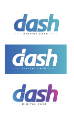
Current logo vs O+M Logo

upload_2018-3-24_15-35-16.png


As of right now. My preference would be too keep orignal from a practical perspective.

From a purely selfish point of view. I also find the O+M logo too restricting in my line of work. I've created well over a 1000 images with current Dash logo not including memes, gifs and t shirt designs. I feel rather limited by the double D and it's proving hard to work with already. I can use the current solo D logo easily to incorporate and manipulate in to images for news articles or even photo manipulation for jokey memes. Just looking at exisitng t shirt designs replacing with the DD logo is not pleasing to the eye.

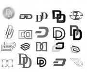
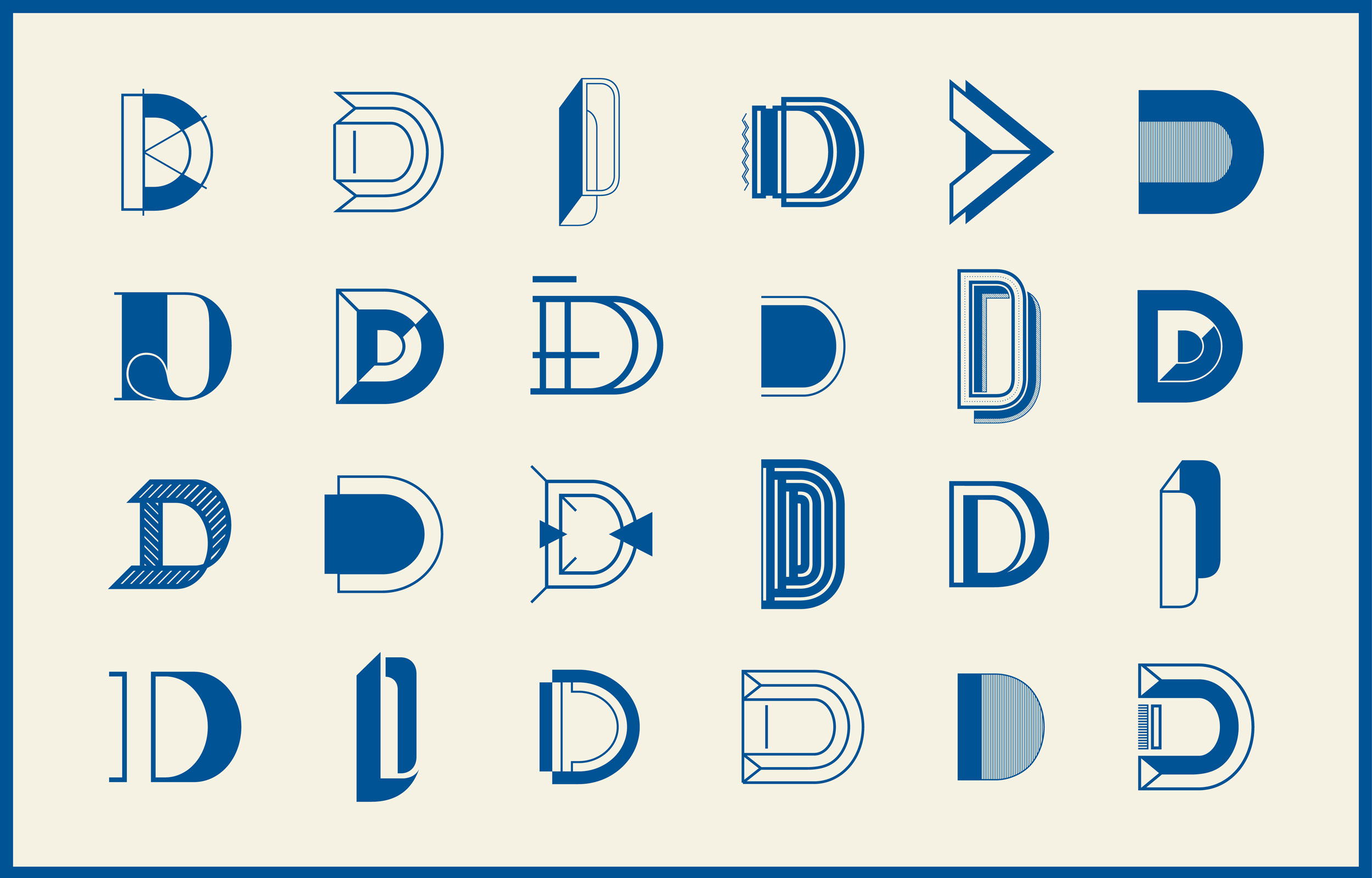
The simplicty of current logo over O+M is important to recognize especially for languages that do not use the same alphabet. If you were living in China & did not know English. If I showed you each logo for 3 seconds and then asked you to draw it on a piece of paper. The current D only consists of 2 simple lines so easy a kid could draw it regardless of native language. The O+M paperclip is too complex to accuratley replicate, would it be recognizable when you factor in design angle etc. Don't believe me try it yourself. Also if you have kids ask them to take the 3 second logo Dash draw challenge.

Which logo is more recognizable?

upload_2018-3-24_16-34-49.png


Is it a diamond? is it DareDevil? is it an hourglass? or is it a paperclip?

O+M logo reminds me too much of Clippy from Windows XP 2001.

upload_2018-3-24_16-26-18.png


The current Dash D has more use as we've seen international communities take ownership proudly using overlays with their nation flags. You are way too limited to customize O+M logo due to thin lines.

With all that being said. I don't like the T&C logo either. It feels like it's been forced when it's not needed. It's about what is fit for purpose. I think this whole rebranding exercise has made me realize just how strong and versatile our current logo is in terms of applications and various media it is used in.

For that reason alone I see no justification for change just for the sake of changing. There was no dissatisfaction with current logo. All value is belief. It's the utility and benefits Dash provides that will carry Dash to the top not the packaging.

We're trying way too hard, trying to fix a problem that doesn't need fixing. The free market will ultimately decide via natural selction if we're truly the best solution in our field. Not based on logo but on functionality and ease of use alone. In my opinion we should be focussing our energy developing the functionality and continue to build from within. Fancy packaging only gets you so far, it's what's inside that counts that determines if people will use Dash again and again.

I'm proud when I tell people about our current Dash logo as last time round the final result was an amalgamation of multiple logo entries by community and it has stood the test of time. I'm proud of that history and I'm not convinced it needs changing.

https://www.dash.org/forum/threads/dash-logo-contest.4394/
https://www.dashfoundation.io/blog/vote-on-the-logo-is-open/

It's a large scale marketing advertising outreach strategy campaign where we need the help most not the logo.

In my opinion all this time, energy and Dash spent on this exercise is a bitter pill to swallow as we could of been advertising and doing outreach efforts for months now utilizing social media platforms what we already had in our arsenal prior to ban announcements. I feel we've missed a real opportunity here. C'est la vie, life goes on.

I'm a true blue Dash fan through and through. If you want folks to know Dash is the champion of digital cash then throw a crown on the current D logo. Get creative and get the message right, don't try and reinvent the wheel from scratch at the expense of losing our identity and history with O+M logo. It's all about the journey folks. Besides Dash is no longer 2 layer. As we learnt in recent Evolution Demo 1 video Dash will be more a blockchain cube. So O+M logo is already outdated in that context.
 
im for keeping or updating the current logo. i was just looking at the bitcoin B on my twitter feed and then saw these O&M 2 ugly double chain link Ds, this has got to be the most amatuer looking logo ive ever seen. it lacks depth and warmth, it doesnt make me feel anything. the current logo D has the makings of a currency symbol, like B for Bitcoin.

update the look, but dont drastically change it

my 2c
 
Hey guys, there are 2 more cents from me.

Let's talk about "readability" of logos. IMO it's very important for logo to be readable and quickly-accurately giving the word "Dash" to people who is looking at it for the first time - for all nations around the world.

The thing that I don't like in our current logo - it's bad "readability" (at least for Russians and I think for many other nations). People can't read our current "D" as "D" without addinional explanatory "dash" word in normal font near it. The same story with our current "A" which can be interpreted as "R". In fact both of our current "D" and "A" letters looks like unclear "alien" or "arabic" letters and don't afford to get the word "Dash" without additional explanations. And it obstructs rapid understanding and memorization.

That is why I like clear "Dash" font in O&M design. In fact their "D" looks like "Sail" to me - very positive and uplifting association...

@alex-ru can you comment on the compatibility with the T&C logo into the Russian symbology/ language?
 
@alex-ru can you comment on the compatibility with the T&C logo into the Russian symbology/ language?

I do not want to criticize anything, but T&C option doesn't look too different from our current logo for me (and it looks even less "readable" because of the "unclear" letter "A"), and therefore not worth more than inconvenience of rebranding. If you do rebranding, then "because of the need," and not just "out of boredom."
 
Having seen and ruminated on the logo for at least many weeks now, I like the O&M logo, though I'm not sold on the purple. However, we have to remember how flexible the visual identity is. We can spin this off with thousands of different iterations, and ultimately that's what'll happen.

I'm just wondering... if you had access to the logo many weeks ago, why did the community not also have access to the logo many weeks ago so we could have had a proper debate over a longer time period. As it stands the debate is going to be rushed and the voting will also be rushed, which is not a good thing for such an important decision and I can't understand why MNO's have been kept in the dark until the last minute. Can you please put this to Dash Core.

I have to ask... Does Dash Core have to much power and influence within the DAO? Does it need to be broken up into its component parts, with each part communicating separately with the MNO's?
 
Where did O&M do their research? I live in conservative America and I guarantee you that their logo would not only be soundly rejected, it would be ridiculed. The conservative class should not be ignored, they have a much greater need for Dash than the left does (which this logo is clearly targeting) as it's the conservatives who are being censored on social platforms, who are being targeted in the media, it's the gun shops who are losing banking access, etc.
 
Status
Not open for further replies.
Back
Top