eduffield
Core Developer
Over the last few days we’ve held a contest for coming up with ideas for our new Dash logo. We’re already narrowed the finalists and now we would like the community to pick our new logo! We have a couple of days to ask the artists to do different variations on the designs, so feel free to ask something specific and we’ll see what we can do.
How will the vote work? We need to select a winner to the contest on Sunday, so we’ll be putting up a page that will allow Foundation members, official team members or anyone with more than 300 posts in DarkcoinTalk to vote. We’ll have these 6 options, let the best logo win!
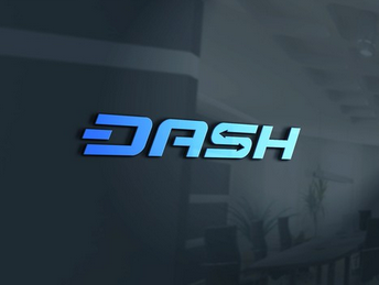
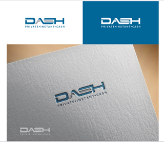
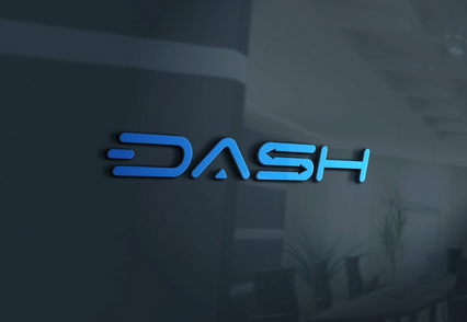
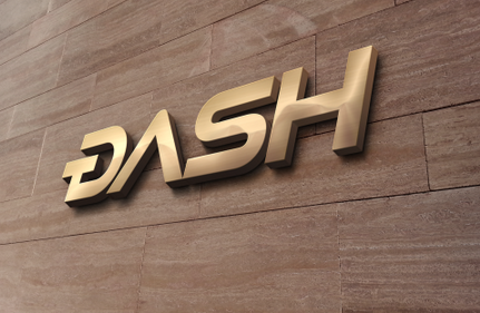
Finalists


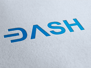
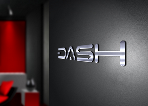
Example Usage
Voting has opened!
Instructions to vote for your favorite Dash logo
A lot of people were asking for us to include the one that Pille designed and posted to bitcointalk a few days ago, so we have included it in the vote also.
1. Go to https://www.darkcoinfoundation.org
2. Click 'My Account' and introduce your username or email and password (if you don't remember you can reset it)
3. Once you are logged in, click on a new page you will see on the top menu called 'Vote Logo'
4. Cast your vote. You can select your two preferred logos or just one, but in that case that one won't count double
Those who are not members of the foundation, but are part of the team, or have more than 300 messages at darkcointalk, please email [email protected], and we will create an account for you so you can vote.
Those who don't fall into the previous categories but want to vote, please join the foundation! It is only 10 DRK for an annual membership.
How will the vote work? We need to select a winner to the contest on Sunday, so we’ll be putting up a page that will allow Foundation members, official team members or anyone with more than 300 posts in DarkcoinTalk to vote. We’ll have these 6 options, let the best logo win!
Finalists
Example Usage
Voting has opened!
Instructions to vote for your favorite Dash logo
A lot of people were asking for us to include the one that Pille designed and posted to bitcointalk a few days ago, so we have included it in the vote also.
1. Go to https://www.darkcoinfoundation.org
2. Click 'My Account' and introduce your username or email and password (if you don't remember you can reset it)
3. Once you are logged in, click on a new page you will see on the top menu called 'Vote Logo'
4. Cast your vote. You can select your two preferred logos or just one, but in that case that one won't count double
Those who are not members of the foundation, but are part of the team, or have more than 300 messages at darkcointalk, please email [email protected], and we will create an account for you so you can vote.
Those who don't fall into the previous categories but want to vote, please join the foundation! It is only 10 DRK for an annual membership.
Last edited by a moderator:
")