• Forum has been upgraded, all links, images, etc are as they were. Please see Official Announcements for more information

New website discussion

Status
Not open for further replies.
@GreyGhost - yeh the proposal is only top level it doesn't have the sub pages in - where there are the CTAs / buttons some of those would link to a sub-page, e.g. masternode investment would be 'participate' -> 'setup a masternode' (or 'learn more') -> masternode subpage - which would be on search optimized URL like dash.org/invest-in-a-masternode or whatever, and i already said you should setup that structure.

EDIT: @GreyGhost I just saw you on the team Slack actually, why don't we just chat there it's a lot quicker :)
 
Last edited:
Update: I just had a Skype with GreyGhost after finding him on Slack...he's actually a really interesting guy with a lot of different experience and knowledge he's bringing to Dash. Mostly we talked about marketing which i feel like i'm in tune with and building a Dash micro-economy with end-to-end privacy with services that are actually useful for us as Dash users. SEO is a pretty minor task compared to what he's doing in other areas and he's kind of wasted on this - just shows talking is so much better to how these forums work sometimes and seems like everyday now i'm meeting new Dash people (new to me anyway) all of whom are extremely smart cookies which I think is the key to any project like this (including Yidakee I just met today too :))...anyhow, we will move forward with TDG and get this site moving so we can get the new version up soon as possible :)

Andy

@AndyDark and @GreyGhost don't worry about SEO yet, I can do much of what Greyghost is going to point out and might just need some help towards the end when we really go full-seo on this design.

Let's get through the design phase first though people! ;]
 
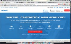
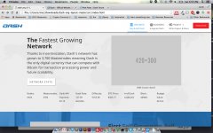
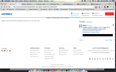
Just wanted to upload a screenshot for anyone who hadn't seen it on Slack.

Still a work in progress of course, I have a few ideas I really would like to pursue like having a nice video of a person using Dash on thier phone to buy something or something similar to that idea as the main background of the header behind the text that is there.

None of this is by any means finalized nor has anyone approved anything, nor have I had a chance to video chat with @kot and get core teams input and what they would like out of this project.

With all that being said, I made a few tweaks to @AndyDark's original design so far on my own accord.

A lot of the stuff I am not showing because its just temporary and I don't feel like it would do any good so heres the one that matters, the upper area EVERYONE sees when they land on Dash.org:

dashorgscreen.jpgdashorgscreen2.jpg dashorgscreen3.png

I am starting to think this website needs to be designed for, first and foremost, the businesses and users using Dash for their first couple months, so we can hold their hands until they've successfully grasped Dash and how to integrate it with their business models, customers, daily routes and such as well as show users why Dash is a perfect investment, savings account, bank account, form of payment, currency and so on and so forth and provide quicklinks to exchanges, wallets, digestible Dash information and news related to users.

The rest of it can be 1-2 clicks away, meaning under dropdown menus, in the footer (which has had some 'improvements' as well), or in sub-links under areas with other similar information. (this would make sense if you saw how I am adding in links beneath videos & Images etc) If we add too much to the navigation and keep making it more complex, we're not really doing our job of simplifying "what Dash is" to the average user.

If we EVER need to show someone the whitepaper, we failed. We should have every important piece that makes Dash amazing and basically have landing pages dedicated to selling those points.

We have a long ways to go, ALOT of content to write, but I feel like if I get off my ass and get together with some of the other team members, get some feedback from the community and then spend wayy too many hours on this thing, we could honestly have a very awesome website...

PS; Who is good at recording videos? I want a 20 second video of someone using an iphone or an android phone to buy something (close up on the hands & phone if possible) but I want it to look professional, and not to be rushed, as it would be the main video being shown on dash.org hopefully.


Oh and, don't go freaking out about anything like the ugly red buttons, everything is still in flux! Just what do we think about the navigation? Is it simplified enough yet? Is something missing? Etc. Be helpful, not hurtful! ;]

@GreyGhost Do you have a url structure I should be using? Other input?
@kot whos a good writer?
@AndyDark thoughts so far?
@Raptor73 Whatsup with some graphical dopeness, I know you have some cool stuff hidden out..
@salmion / @darkwing / @tungfa Can I has those icons please? I'll send over the "ok" from the original author if you guys would like, stop hiding out with them though! ;[
@fernando See anything missing/ bothering you?
@Everyone Why is this red so ugly?
 
Last edited:
@TheDashGuy it is looking good :)

I like the double nav bar, sending news and 'get involved' up there helps a lot to clear some space.

I agree that the first impression should be tailored to new users, the others will click/scroll if they need. And it is not possible to cater to everyone! However, I'm not sure about businesses. They both go together, but I think that we really need to increase our base of enthusiasts and power users before we can really support an ecosystem of merchants. The big red Evolution button is not very consistent with catering to new users. Once we have it, the site will change. Until then, that is a page for enthusiast and developers.

A couple more things about menu items:
  • We need something up there with a big HELP or SUPPORT sign. Just now I have answered a couple of emails. One has done a tx that "is still processing and I want to cancel" and the other needs to know how to convert darkcoins to dash. There is a lot of people out there that are clueless and need our help. New users are important, but keeping the ones we have is also key!
  • Download has to be somewhere. Atm, our product is a download, so we can't hide that.
All other things I'm fine sending to the bottom, drop down or whatever.

I will not touch on design because I'm just one user and you are doing this. It is great that you share, but you can't listen too much or you'll need to pass a therapy reimbursement proposal.

EDIT: Also, I think we need the language selector on top. If someone doesn't get the page in his desired language he needs to be able to change fast and easy or he will leave.

All wonderful feedback most of which has skipped my mind. Thanks!
 
@TheDashGuy
Thanks for you designs - they look elegant!

1. I would not recommend to use red color for any buttons/links on website - red color is alarming «dangerous, don’t press it!» (and red doesn’t match with blue without «white» separator)

My idea is - let’s add 1 additional color to our color-schem for buttons - GREEN - it perfectly matches with our Blue and helps to attract positive attitude - GREEN «it is safe, correct - press it!»

Please have a look here:
http://www.colorcombos.com/color-schemes/1428/ColorCombo1428.html
+
https://www.bolehvpn.net
2. "language selector on top" - Yes, it's very important - for not loosing international visitors.

3. @fernando "Support for Users" - I think directing them to Forum is correct approach (instead of "centralized dedicated support-service") - we can create special Section there "Urgent help for Newbies"

4. Short "smartphone demo" video - if we really (?) have to replace current "What is Dash? video" [I am not sure! There are so many mobile payment services these days - so showing people "just one more" isn't enough - we have to explain how Dash is different from all of them].
Well - it should be easy understandable without sound. As wallet interface will be changing during Evolution, we could temporary use some abstract video like this: http://www.shutterstock.com/ru/vide...-store-directly-from-a-smartphone-device.html
 
Last edited:
@TheDashGuy - Great progress, looking good.

Love the video idea. Would that need to be actual video, of a hi-ref gif? What is the least heavy loading time, bandwidth intensive format needed to do it?
 
Just wanted to upload a screenshot for anyone who hadn't seen it on Slack.

Still a work in progress of course, I have a few ideas I really would like to pursue like having a nice video of a person using Dash on thier phone to buy something or something similar to that idea as the main background of the header behind the text that is there.

None of this is by any means finalized nor has anyone approved anything, nor have I had a chance to video chat with @kot and get core teams input and what they would like out of this project.

With all that being said, I made a few tweaks to @AndyDark's original design so far on my own accord.

A lot of the stuff I am not showing because its just temporary and I don't feel like it would do any good so heres the one that matters, the upper area EVERYONE sees when they land on Dash.org:

View attachment 2432View attachment 2433 View attachment 2434

I am starting to think this website needs to be designed for, first and foremost, the businesses and users using Dash for their first couple months, so we can hold their hands until they've successfully grasped Dash and how to integrate it with their business models, customers, daily routes and such as well as show users why Dash is a perfect investment, savings account, bank account, form of payment, currency and so on and so forth and provide quicklinks to exchanges, wallets, digestible Dash information and news related to users.

The rest of it can be 1-2 clicks away, meaning under dropdown menus, in the footer (which has had some 'improvements' as well), or in sub-links under areas with other similar information. (this would make sense if you saw how I am adding in links beneath videos & Images etc) If we add too much to the navigation and keep making it more complex, we're not really doing our job of simplifying "what Dash is" to the average user.

If we EVER need to show someone the whitepaper, we failed. We should have every important piece that makes Dash amazing and basically have landing pages dedicated to selling those points.

We have a long ways to go, ALOT of content to write, but I feel like if I get off my ass and get together with some of the other team members, get some feedback from the community and then spend wayy too many hours on this thing, we could honestly have a very awesome website...

PS; Who is good at recording videos? I want a 20 second video of someone using an iphone or an android phone to buy something (close up on the hands & phone if possible) but I want it to look professional, and not to be rushed, as it would be the main video being shown on dash.org hopefully.


Oh and, don't go freaking out about anything like the ugly red buttons, everything is still in flux! Just what do we think about the navigation? Is it simplified enough yet? Is something missing? Etc. Be helpful, not hurtful! ;]

@GreyGhost Do you have a url structure I should be using? Other input?
@kot whos a good writer?
@AndyDark thoughts so far?
@Raptor73 Whatsup with some graphical dopeness, I know you have some cool stuff hidden out..
@salmion / @darkwing / @tungfa Can I has those icons please? I'll send over the "ok" from the original author if you guys would like, stop hiding out with them though! ;[
@fernando See anything missing/ bothering you?
@Everyone Why is this red so ugly?

Hey, sorry for the delay I was offline for a few days and i'm not checking forums much just on slack or email [email protected]

"I am starting to think this website needs to be designed for, first and foremost, the businesses and users using Dash for their first couple months, so we can hold their hands until they've successfully grasped Dash and how to integrate it with their business models, customers, daily routes and such as well as show users why Dash is a perfect investment, savings account, bank account, form of payment, currency and so on and so forth and provide quicklinks to exchanges, wallets, digestible Dash information and news related to users."

Like your designs and i'm on the same page with this. I've had more ideas since the layouts but I think the priority now is just running with what we've got (and your designs) as it's good enough for now and we'll need to do a V2 when Evo comes and I think this is a nice stopgap. On that basis i'm recommending minimizing the CMS side too but that's on the backend. So yeah my opinion, I would say keep going it's looking good and not too far away from going live. But ditch the red, just use whatever colors you thinks best ;)
 
hey guys
good effort on the redesign
(sorry i am a bit late to the party)

a couple of pointers
- a lot of posts are above regarding colors and such
PLEASE stay in the recent Corporate Identity !
(all pages, guides, wallets 12.1, .... are running on the same color theme and i would NOT recommend changing this now and again, we finally will have all on 1 track !)
- i agree, that the red buttons are super red and i would change that
- I am missing our 'red line', i suggest something around here:
yYe61O5.jpg


- FrontPage
i think we need a better background image there, faded (as we always had 50% white and not blue)
with people interacting with payment system

how was that call between you 2 ?
 
Then I would suggest dark grey buttons those turn into blue when you "mouse over" them.

Red line looks good. :)
 
+1 on the above comments. The red button screams "Do Not Press" to me, and is very intrusive, bright and non-inviting. My only gripe is grey looks terribly dull, and cannot think up any suggestion right now

The red line is quite subtle and completely aligned with all our previous presentations and and associated materials, it is part of our branding
 
Last edited:
Any feedback ? :rolleyes:
u guys had a call and all

Per @kot (feel free to confirm/den any of this lol)

I am on the right track, wish I had more time to spend on this on the daily but so far i've mostly just worked on the navigation setup etc so I will keep hammering on this thing then as I told @kot I will try to have a solid v1 by the 1st and then we'll have another call or two concerning the direction at that point with certain people in the core team.

I will be doing my best to simply focus on our core principles of Dash and not veer off too much into the details as we can always add in secondary/tertiary links around the website after it makes sense visually to a new user and lead them off into the more detailed websites.

Trying to cover EVERYTHING Dash does/can do on one site is near impossible so focusing on the digital cash aspect, ROI of Masternodes and things like that should in theory work better than just throwing all this technical mumbo jumbo onto a page and forcing people to digest it.

With that being said, feel free to ask about specifics, but I am mainly just working on the simplification of what I was given so far.

I'll try to post more updates, but based on me and @kot's call we're doing just fine, just moving slowly right now based on my lack of time. (Working on it more tomorrow & the next day.)
 
@AndyDark @fernando @kot @Minotaur is this going to be a static site, or a wordpress site? or something else?

Edit: Also looking for someone in the community capable of making a awesome "short video" literally showing someone buying something with Dash on thier phone with a QUALITY CAMERA.

Example:

But "just the part where people actually use the phone to do something", just showing "hands and the phone"
 
Last edited:
Status
Not open for further replies.
Back
Top