New website discussion

Status
Not open for further replies.

fernando

Powered by Dash
Foundation Member
May 9, 2014
1,527
2,059
283
As many know, some of us in the team have been working on the new site. The project is delayed because we went back to the drawing board to reconsider everything instead of just doing a cosmetic redesign.

The biggest obstacle until now has been deciding on what we really want for the website. Something focused on new users? investors? developers? a bit of everything???

Yesterday we discussed a structure proposal I did that tries to cover all bases. The homepage would be very simple, with a call to action for new users above the fold and a big index/menu below the fold, with everything easily accessible from there. AndyDark is preparing now an alternative with a longer homepage that would cover all sections too.

I attach below the annotated images of my proposal so anyone can give feedback. Please consider that this are just mockups. We are not discussing the aesthetics now, we are just trying to get to an agreed structure. We need to decide what type of website we want and then on the specific sections and such. There are not right or wrong answers to some of the questions, so please don't hesitate to post your ideas (btw, I'm gonna be travelling until Saturday, so if I don't answer/participate more it is because I haven't read).
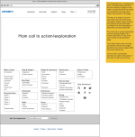
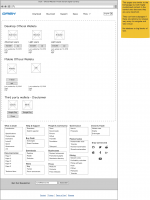
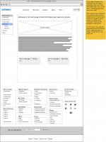
Homepage.png
Page in top menu.png
Page in section.png
 

GreyGhost

Well-known Member
Foundation Member
Jun 4, 2014
303
556
263
Santa Monica, CA
fernando I see the amount of efforts put into this. While I'm sorry to be the bearer of bad news our site is too important to just go gaga about the efforts and disregard elements that can and should be improved. A few points only because I, as a solution-focused pro, am kind of lost if I am not sure what's the purpose of comments. Nevertheless:

-- "MORE" as the Main Navigation drop-down menu. Drop-down menus are fading off the Web. "Drop-downs are relics of our point-and-click past, replaced by minimalist navigation schemes designed around mobile-friendly taps and swipes," and as such are bulky, clumsy, and, worse of all, require an user to WORK in order to explore what should be OBVIOUS;
-- below the fold tries well too hard. It looks like we're trying to cram in everything in that poor little space that no one is going to really explore in full;
-- the Search Box is best as 27 characters long, well, box. The current solution proposed takes too much of a valuable space

Than "details" (the devil is in the detail," is another big secret of a successful website):
-- Newsletter needs to be UP. It is a DIRECT call to an user to ENGAGE with us and it MUST NOT be hidden in the footer.
+++ Talking details. Let us please ponder: "Subscribe" (Enlist!!) vs. "Join Us" (be a part of something) Which one do we think people prefer? A hint: "Join us"
-- FORUMS must be accessible from the Main Nav or, better from the secondary, Upper Nav given that our might get busy. Same with the BLOG and, given our niche, GITHUB links.
-- "Stay Connected" is another feature of INTERACTIVITY that should NOT be hidden in "below the fold".

The cardinal sin of the proposed design is its navigation structure I am sorry to say. Page 6 of my dash.org SEO Audit (http://document.li/W9gZ) deals with the Nav Menu in more detail. While we can debate is one term ("P2P economy" I know fernando dislikes :) suitable or not) or another, we SHOULD NOT have our MAIN FEATURES linking from the root.

I firmly believe our MAIN advantages / "key selling points" are:
-- DarkSend soon to be Privacy Protect;
-- InstantX as the huge advantage for merchants and the money remittance business alike;
-- Masternodes as an investment;
-- Governance.
These must be emphasized.

With a caveat -- who is the INTENDED AUDIENCE for the dash.org? The proposed design does not seem as 100% sure about it. As such, it seems like it wants to "please everyone" and gives info for everyone so the information is still "disjointed, without a clearly defined central theme."

I really worry more work, time and money will enter into this development without producing the best possible outcome. My feeling is that you guys are getting closer but are not there yet...
 

TanteStefana

Grizzled Member
Foundation Member
Mar 9, 2014
2,876
1,866
1,283
Well, I don't know if my 2 cents are worth anything, but I have a comment as a user. My problem with all the websites I've seen is that they can never tell me any basic facts. Ethereum's website does a good job of explaining now, but it didn't used to. Bitshares sells their product on what it can do, but not how it does it. And frankly, there is no magic without the how. These services exist in the "normal" world, why use Bitshares (not only that, what I've dug up on their system, I don't like as it creates a good ol boy network, and isn't nearly decentralized enough to even think of calling it decentralized) But you can't discover any of the details, 'cause they don't give 'em.

So, what I as a user would want to see immediately (or easy to find from home page) is

1. the stats (how many coins/blocks/etc... ) like what you see on the OP of bitcointalk - as well, hopefully, as a chart that shows current number of MNs, price, coins outstanding, etc...
2. In easy language to understand, the structure of the network, with a graph of probabilities on privacy, etc..
3. For the ease of use wallet in Evo, I think a simple explanation of how it'll work, what you can do with it - but not to the degree of the white paper - would be great. Just keep it easy to read and engaging - no crypto-speak
4. Talk about the DAPI and give ideas of the types of services that can be built on top of it
5. How the Masternodes create a unique investment opportunity

All those points should be written in a clear - easy to understand way

Of course the Wiki and white papers should hold all the details, but we need as much of this condensed and simplified in order to pull people in - before they lose interest being bogged down in too many details.

Anyway, that's what I always want to see, when I go to one of these websites, and it's seldom that I get any of it. So just my 2 cents :)
 
B

buster

Guest
I have one question only. If there are funds remaining in the website budget why are we not spending them to hire a professional? What I hear often is "we are busy, we all have our own lives, we all have families, etc etc." - There is much truth to those statements but they are not the real problem and the solution is use the funds we have to hire a pro. The opportunity cost alone should worry people.

One response to this is "we cant just say 'here's some money make us a website'" - This is true. A web developer will probably laugh at us if we handed her our project without any mockup's or anything. But who is to say the budget funds can not be used to hire a professional who can help us lay out the website? If there are people with the technical skills to build the website in the community, GREAT. What I see lacking is a professional who can layout the website. As much as I appreciate the people working on this and their effort, 5-6 months of failure might be the Que to let someone else step up.

*edit to clarify, I am not saying the people working on this CANT do it. I'm just wondering, do they have the time to do it? Paying a professional would ensure completion of the project in a timely manner.
 
Last edited:

itscrazybro

Active Member
Apr 14, 2014
137
219
93
I completely agree with GreyGhost, currently the best designed websites are https://www.ethereum.org/, http://maidsafe.net/ and http://factom.org/. All three websites use a similar format to what you have drafted fernando, however they prodominantly rely on a single page scroll down with multiple call to actions on the way down. I think we should be basing our design off of the best aspects of these three websites. As Picaso said "Good artists copy, great artists steal.". There is no need to go reinvent anything, the layout is already there, just copy it and make small tweaks. Scroll down with multiple CTA's is crucial in my opinion though.
 

TroyDASH

Well-known Member
Jul 31, 2015
1,254
797
183
I completely agree with GreyGhost, currently the best designed websites are https://www.ethereum.org/, http://maidsafe.net/ and http://factom.org/. All three websites use a similar format to what you have drafted fernando, however they prodominantly rely on a single page scroll down with multiple call to actions on the way down. I think we should be basing our design off of the best aspects of these three websites. As Picaso said "Good artists copy, great artists steal.". There is no need to go reinvent anything, the layout is already there, just copy it and make small tweaks. Scroll down with multiple CTA's is crucial in my opinion though.
I was actually hoping the site would *not* look like ethereum.org, maidsafe.net, factom.org. Every goddamn cryptocurrency homepage looks the same and they all scream "I'm a cheap scam" regardless of whether or not this is actually the case. The best one is http://www.bitcoin.org. IMO, if your homepage scrolls down more than 2-3 pages, you're doing it wrong. Even though I am completely on board with the website redesign project, I think the current dash.org site already beats most crypto websites.
 

crowning

Well-known Member
May 29, 2014
1,414
1,997
183
Alpha Centauri Bc
fernando A few points only because I, as a solution-focused pro,
Here you had me!

fernando -- "MORE" as the Main Navigation drop-down menu. Drop-down menus are fading off the Web. "Drop-downs are relics of our point-and-click past, replaced by minimalist navigation schemes designed around mobile-friendly taps and swipes,"
Here you lost me. Completely...

------------------------------
| Parental advisory
| Explicit Posting
------------------------------


Now I wanna kill you!

Slowly...

With a rusty chainsaw or something...

And feed baby-sharks with the remainders..

Hoping they'll become great white sharks, swim up Redmond and kill Microsofts UI-designer team...with a short stopover at Cupertino...

[ DISCLAIMER: this is not personally addressed at you, GreyGhost ]

4 years ago I was very annoyed to navigate through 20 menus with 100 sub-menus on my tablet...but nowadays I'm even more annoyed to have a dual-4k-monitor setup on my PC showing me 8 gigantic annoyingly colored fucking buttons on 2 5120x2880 screens.
Which I have to click on to see the next population of annoyingly colored buttons. Which will navigate me to the buttons which will allow me to, as I find out, do everything BUT what I wanted to do.

HELLO! We're in 2016!

If you want to show me a UI, do find out whether I'm using a PC, tablet or phone or something in between. And if you're too dump to figure that out hire someone who can. It's not rocket science. Or, if it were, hire a rocket scientist. Or let the end-user decide which UI-presentation she prefers.

We had (more or less) great UIs for PCs with Windows 7, with Windows 8 they were fucked up for both, PC and tablets/phones, and with Windows 10 I have to use Google search to find out how to remove those gigantic tiles. And, much to my disappointment, the web follows and praises this as the best thing since sliced bread.
I neither want to tap and swipe with my mouse, nor do I want to Ctrl+Shift+F1 with my mobile.

By now every software company worth mentioning should have a good architectural separation of UI-layer and application layer, so it's not TOO much work to keep the PC UI along with the tablet or phone UI.
Right?
RIGHT?

Thank you, I feel better now.

TL;DR
Make UI depending on where it's used, not on what's 'en vogue'.
 
Last edited by a moderator:

GreyGhost

Well-known Member
Foundation Member
Jun 4, 2014
303
556
263
Santa Monica, CA
Here you had me!
If you want to show me a UI, do find out whether I'm using a PC, tablet or phone or something in between. And if you're too dump to figure that out hire someone who can. It's not rocket science. Or, if it were, hire a rocket scientist. Or let the end-user decide which UI-presentation she prefers.

We had (more or less) great UIs for PCs with Windows 7, with Windows 8 they were fucked up for both, PC and tablets/phones, and with Windows 10 I have to use Google search to find out how to remove those gigantic tiles. And, much to my disappointment, the web follows and praises this as the best thing since sliced bread.
I neither want to tap and swipe with my mouse, nor do I want to Ctrl+Shift+F1 with my mobile.
Well, when I am "in charge" of any web development (yeah, I read your tiny disclaimer:) only that I am not sure that what I wrote about the "MENU" from the mock-up was a clear statement against drop-down as proposed...) I have the guys create different versions for different user agents. Nothing is as simple as that. Dash site is a conceptual challenge and that's why the guys struggle with it so much. Just check what itscrazybro and TroyDASH wrote above to gauge different opinions.

Design wise, while this example is NOT really how it should look like -- the future dash.org site -- I'd be thinking along the lines of http://www.madwell.com/.

I would love to see our future site having a bad-ass, unique design that is being shared all over the Net. Think of a 404 page, usually the useless blind alley, but if it's done like this one: http://www.bluedaniel.com/404 than it becomes an example of a brilliant 404 page design that is shared (linked to) all over the Net and as such helps to increase the site's ranking.
 

crowning

Well-known Member
May 29, 2014
1,414
1,997
183
Alpha Centauri Bc
I'd be thinking along the lines of http://www.madwell.com/.
Looks beautiful, and needs only 187 seconds to load over here (yes, I REALLY stopped the loading time).

...http://www.bluedaniel.com/404 than it becomes an example of a brilliant 404 page design
Having a "page not found" page which needs JavaScript AND a third-party plug-in isn't the solution, it's part of the problem.

Sorry to sound a bit negative, but I don't want to win a beauty-contest with a web-page, I want it to be usable and load in a reasonable time.

If it's fast and usable AND you can make it sexy, then you're golden. But usability is first!
 

GreyGhost

Well-known Member
Foundation Member
Jun 4, 2014
303
556
263
Santa Monica, CA
If it's fast and usable AND you can make it sexy, then you're golden. But usability is first!
Negativity not noticed for it is misplaced. We're talking and throwing ideas here, not building the site, at least it is not me who is doing it. I did the audit of the current site and clearly said:
-- UX (usability) is always the main concern. Current or proposed Nav is simply not good enough. But I am the one who does not want to go too negative and I do not know how to really discuss these issues unless I clearly state the proposed design will not work. Here, I said it (a thread message will not give you an answer what works);
-- page speed is one of the current site's key problems that need to be addressed. I guess that presuppose the new site also should be fast. I had a suggestion for the mobile version to be loaded instantly everywhere as well;
-- and when I give an example of DESIGN, like in the madwell site, I do not worry about its SPEED, rather its LOOK (and its only an example how thinking might go forward), so that "negativity," a valid critique of its slowness, is moot re: the point I was making.

So, I fully agree with your statement -- "If it's fast and usable AND you can make it sexy, then you're golden. But usability is first!" -- only that we're approaching the topic from different angles.
 
Last edited by a moderator:

AndyDark

Well-known Member
Sep 10, 2014
384
728
163
Hi - i joined the meeting on this yesterday and proposed a long-scroll responsive version of Fernando's landing page with the addition of 5 or 6 CTAs linking to Fernando's main site layout with the nav on the top left. CTAs are for the main use cases like buying Dash, spending Dash, earning (mining / masternodes), voting (governance), community (forums/social) and each will contain large links to the relevant main site pages or the major ecosystem sites.

The main goal for the landing page is to drastically improve content discovery so it takes less time to arrive where you want to go after landing at dash.org whether that's to a dash.org page or wiki page or ecosystem site. Also improve the graphic design and speed.

Myself and some of the guys from the webteam like acidburn are going to do build a basic layout idea in bootstrap so we can see how it flows and have something to build on. next stage would be working with a graphic designer to produce the look & feel.

So if we can wait until Wednesday I can post the layouts for people to try out and comment on.
 

TroyDASH

Well-known Member
Jul 31, 2015
1,254
797
183
Can someone give me a reason why these long-scroll homepages are good? If someone is coming to my homepage, I want them to be able to *find* exactly what they are looking for on the first page if not the second page of scrolling down. Do they want to join the community? Learn about DASH's features that make it better than Bitcoin? Learn about what it means to become a masternode operator? Getting started as a DASH user (wallet, and where to buy or spend DASH)? Seriously, if I can't immediately see something to navigate to for all of those reasons I might be visiting the site, on the first one or two pages, I'm already tuned out.
 
  • Like
Reactions: Blend43

AndyDark

Well-known Member
Sep 10, 2014
384
728
163
Can someone give me a reason why these long-scroll homepages are good? If someone is coming to my homepage, I want them to be able to *find* exactly what they are looking for on the first page if not the second page of scrolling down. Do they want to join the community? Learn about DASH's features that make it better than Bitcoin? Learn about what it means to become a masternode operator? Getting started as a DASH user (wallet, and where to buy or spend DASH)? Seriously, if I can't immediately see something to navigate to for all of those reasons I might be visiting the site, on the first one or two pages, I'm already tuned out.
most users are on mobile now and when they land they will just swipe up the screen. long scroll lets you hit them with the key calls to action along that journey without them having to really do anything and they just click the one they want. with dash.org we are talking about the landing page really as a cover page to just get the different categories of users into the right area of main site or onto the ecosystem site their looking for, where they can get the detail. At the top will still be a big 'download' and 'learn more' button.
 

AndyDark

Well-known Member
Sep 10, 2014
384
728
163
Can we not have m.dash.org for mobile?
theres more to it than I wrote, mobile or not doesn't really matter it's about how most users discover content and how to make that easy for Dash's case, that doesn't have to be long scroll. it's going to be hard trying to communicate on that here and also slack/skype so if you can let me work with those guys and come back when it's at the next stage.
 
Last edited by a moderator:
  • Like
Reactions: Blend43

TroyDASH

Well-known Member
Jul 31, 2015
1,254
797
183
I guess it's hard for me to imagine that -most- users are coming in through mobile unless it's to download a mobile wallet app. Even if we do get a lot of mobile users, mobile web design and PC web design don't mix well. It would be better to have a separate mobile layout like most other sites do. The long scroll is not bad for mobile but it's horrendous for PC, in my opinion
 
  • Like
Reactions: Blend43 and AjM

itscrazybro

Active Member
Apr 14, 2014
137
219
93
Hi - i joined the meeting on this yesterday and proposed a long-scroll responsive version of Fernando's landing page with the addition of 5 or 6 CTAs linking to Fernando's main site layout with the nav on the top left. CTAs are for the main use cases like buying Dash, spending Dash, earning (mining / masternodes), voting (governance), community (forums/social) and each will contain large links to the relevant main site pages or the major ecosystem sites.

The main goal for the landing page is to drastically improve content discovery so it takes less time to arrive where you want to go after landing at dash.org whether that's to a dash.org page or wiki page or ecosystem site. Also improve the graphic design and speed.

Myself and some of the guys from the webteam like acidburn are going to do build a basic layout idea in bootstrap so we can see how it flows and have something to build on. next stage would be working with a graphic designer to produce the look & feel.

So if we can wait until Wednesday I can post the layouts for people to try out and comment on.
Sounds perfect AndyDark, can't wait to see the mock up.

TroyDASH, mobile/tablets are where all young people are now. Hence the trend in scroll down websites with multiple CTA's to replace or work with the cluncky old top menu. This technology is going to be picked up by the younger generations, not the older generation, so I say we cater for them.
We need to have our key points and multiple CTA's on the home page, that is our "book cover" and sadly most people still judge a book by its cover and don't read any deeper unless interest is sparked. The homepage needs to highlight our key features and anything that might attract someone. So things like, InstantX, PrivacyProtect, Masternode as an Investment, Governance and Evolution should all be covered here. I doubt many can scroll past all these features without being interested in at least one.
 

TheDashGuy

Well-known Member
Dec 16, 2015
1,228
1,010
183
Hmm. I guess I'll wait for some real mockups as opposed to a wireframe of 3 pages before I really start to dig into and give some opinions.

One thing I will say is the download button in the nav should be the furthest thing to the right and it should look different than the rest of the nav items as to call attention to it.

We need to cover the top 5 reasons as to why someone who just google something like "what is dash" or "why is dash useful" should give Dash anymore time.

Your landing page is your business card, you have under 5 seconds to capture the appeal of Dash for the users, pelase don't skip out on this:
http://www.usefulusability.com/5-second-test/

Also: http://blog.usabilla.com/the-squint-test-how-quick-exposure-to-design-can-reveal-its-flaws/

Also, the current wireframe looks like it's lacking ALOT of meat. If the website ends up being a big link directory as the home page, I'm sure you will see a huge drop in traffic.

Make it fun, make it useful, add some fun what is dash intro and tip out .0005 Dash or something in return for emails and then email blast everyone when there is an update.

I can go on and on and on but I'll wait, just lets not squander this chance to hit the new website out of the park.

Glad to see we're having this conversation. Thanks for being awesome fernando and the other core team members!
 

TroyDASH

Well-known Member
Jul 31, 2015
1,254
797
183
Sounds perfect AndyDark, can't wait to see the mock up.

TroyDASH, mobile/tablets are where all young people are now. Hence the trend in scroll down websites with multiple CTA's to replace or work with the cluncky old top menu. This technology is going to be picked up by the younger generations, not the older generation, so I say we cater for them.
We need to have our key points and multiple CTA's on the home page, that is our "book cover" and sadly most people still judge a book by its cover and don't read any deeper unless interest is sparked. The homepage needs to highlight our key features and anything that might attract someone. So things like, InstantX, PrivacyProtect, Masternode as an Investment, Governance and Evolution should all be covered here. I doubt many can scroll past all these features without being interested in at least one.
I feel that these scrolling websites can work well for visitors who are brand new to the site. You can scroll through and see a bunch of interesting things, displayed creatively as a kind of narrative. But for anyone returning to the site, it's just a nuisance. If I go to ethereum.org and I already know what I want to do or find out on the site, such as look up technical documentation, or connecting with the ethereum community, navigating that homepage is a huge pain in the ass, I would rather just search google than go through ethereum.org. Maybe it is a trend among younger people? I'm admittedly not an expert in this field but I'd be interested in seeing some research into the effectiveness of that style.
 

TheDashGuy

Well-known Member
Dec 16, 2015
1,228
1,010
183
Here you had me!


Hoping they'll become great white sharks, swim up Redmond and kill Microsofts UI-designer team...with a short stopover at Cupertino...
You live in Seattle? Or is Redmond just more renowned than my Washingtonian self realizes?
 
  • Like
Reactions: Blend43

TheDashGuy

Well-known Member
Dec 16, 2015
1,228
1,010
183
I feel that these scrolling websites can work well for visitors who are brand new to the site. You can scroll through and see a bunch of interesting things, displayed creatively as a kind of narrative. But for anyone returning to the site, it's just a nuisance. If I go to ethereum.org and I already know what I want to do or find out on the site, such as look up technical documentation, or connecting with the ethereum community, navigating that homepage is a huge pain in the ass. Maybe it is a trend among younger people? I'm admittedly not an expert in this field but I'd be interested in seeing some research into the effectiveness of that style.

This type of menu system might solve your problem:
https://codyhouse.co/gem/mega-dropdown/

I for one, think we should most definitely go for a nice long-scrolling beautiful website, thats obviously useful and purposeful as well.
 
B

buster

Guest
Well, on the other hand there is Warren Buffet's Berkshire Hathaway. A company controlling half a trillion (yes trillion with a T) dollars in assets. i don't know how much they've spent on their website but it was worth every cent.
http://www.berkshirehathaway.com/
Oh man what a beautiful website. It's even responsive to my mobile device! hahahahah. Oh man, I wonder who got paid to make that. I hope they didn't pay a web developer.


This type of menu system might solve your problem:
https://codyhouse.co/gem/mega-dropdown/

I for one, think we should most definitely go for a nice long-scrolling beautiful website, thats obviously useful and purposeful as well.
That is a great menu, I'll be stealing that! Thank you sir.
 

fernando

Powered by Dash
Foundation Member
May 9, 2014
1,527
2,059
283
Thanks everyone for taking the time to give feedback. And don't worry about tearing things down, we all should have thick skin by now and I think we can all agree that we all want the best for the project. If my proposal works as a conversation starter that brings us somewhere, I'll be more than happy.

One of the greatest things about this thread is that it shows why we have been struggling for all this time (btw, the people in the project changed, not everyone involved in the beginning is still involved and some got involved later on). There are as many opinions as people :)

A few thoughts/responses:

buster I don't think we can hire someone to help us decide what we want our website or Dash to be. Being Dash a open source project we are always gonna have a problem with this. At least in the coding side things are less subjective (or fewer of us understand what is happening!) and github rules, but in this area of the project there is no decision hierarchy and we will always struggle. We can't change that, so I think we can only embrace who we are and try to get to something most of us love.

Regarding long scrolling pages, I'm with TroyDASH. I understand that they are great for certain things, but I hate them in most cases. If you remove the top menu and force people to move through a specific path like ethereum.org does, then I hate with all my soul... that reminds me too much to going to Ikea and having to follow the path set for me. Maidsafe.net I like more. Factom.org not that much, most info is at the bottom and that is far away. Just my opinion as a user though!

GreyGhost I guess I didn't explain myself correctly about the More item in the top menu. What I was suggesting is that when the user clicks there the page auto scrolled down to the big menu/index, although I agree that a lot of thought would need to be put into how to display that. In any case, I agree with you about the need to have structure, and to me the long scrolling pages don't provide them. We may argue about the specific items in the menu, adding an upper nav menu or a search box, but I think we both want information in small pieces and with structure.

In your SEO audit you say we should have links in the form dash.org/section/page instead of dash.org/page. That is compatible with anything we do, even in my proposal there are sections in that huge index and setting up links like that would be easy. I don't like it because they are more difficult to communicate (maybe we should have a link shortener?) and prevent us from changing the structure without changing the links, but you are the SEO expert, so if you say that is important I'm with you unless someone else brings a better argument :)

As for mobile, I'm assuming that whatever we do, we'll use responsive design. Even the most simple wordpress themes do this quite well nowadays. In my proposal rearranging the bottom menu would be trivial and the call to action can be designed in that way too. However, even if it is true that many people access the web via mobile, I don't think that is so prevalent in our space. In the last 30 days we had 67% sessions from Windows, 11% from Mac, 9% Android, 7% Linux, 6% iOS. I expect this will change with Evolution, but nerds will always be nerds and we will prefer a real computer.

Anyway, we'll [email protected] proposal soon and I'm sure that will be another step forward, so I'm confident we'll move in the right direction.
 

TanteStefana

Grizzled Member
Foundation Member
Mar 9, 2014
2,876
1,866
1,283
Looks beautiful, and needs only 187 seconds to load over here (yes, I REALLY stopped the loading time).


Having a "page not found" page which needs JavaScript AND a third-party plug-in isn't the solution, it's part of the problem.

Sorry to sound a bit negative, but I don't want to win a beauty-contest with a web-page, I want it to be usable and load in a reasonable time.

If it's fast and usable AND you can make it sexy, then you're golden. But usability is first!
I just want to put in my 2 cents. I agree with Crowning that I find such websites (http://www.madwell.com/) really annoying, especially since it took over 3 minutes to load, and there was virtually no information. I was so caught up in the moving pictures that I didn't realize those bars actually had bytes of information written on them.

An easy to navigate, clear, concise information that I'm looking for (posted page 1) is what I want first. After that, if you can get it to look pretty - great! And if these rolling pages work better on mobile phones, why can't we have a mobile site and a desktop site, like Crowning said? Ah well, then again, I'm seriously an old fart and don't even have a mobile phone :confused::cool:
 
Status
Not open for further replies.