FTFY:wink:Because 18M market cap is so large. Fork all you want, you won't have an expansive masternode network or talent. Fork off.
You are using an out of date browser. It may not display this or other websites correctly.
You should upgrade or use an alternative browser.
You should upgrade or use an alternative browser.
Official Statement On Rebranding To Dash
- Thread starter eduffield
- Start date
Sir I wish you well... And sorry to see you go. I gave been with Darkcoin since it's beginning... Jan 2014. I've seen hundreds come and go.... The name change has been discussed since that time... And been in the works since then, and finally implemented. This is about much bigger then a bit of trading & mining etc... This is a money utility revolution. How this project has evolved is mind bending. This isn't for everyone... And I wish you luck.As I said, this is a business. Darkcoin has done right by me, much profit. I hope you are right, because I would happily ride this chain again. Until then I suppose.
This thing is so sexy I would LOVE to add it to the official wallet's "About Darkcoin Core" popup right now....but I guess Evan would kill me :grin:
I'm glad you and many others in the community like my work...
")
Damn right we do! :grin:I'm glad you and many others in the community like my work...
Good job!
darkred
Active member

About this logo I love the font and the inverted C and obviously the animation just makes it really cool, but I am having a lot of trouble with the "-" it just makes me feel like is a minus sign.... I feel like it says "less cash"... I almost didn't post this but decided to do it before I gave into group thinking... I would love to see an option... that uses an arrow like alex-ru was suggesting... I didn't post his example side by side... because it was ugly as he is not a designer so it wouldn't be fair to the idea... but at least the arrow would make me feel... like moving forward... "more cash coming" .... I don't have the exact answer... I just wanted to share my honest feelings... Even if it is not an arrow... I think we can try more options...
alex-ru Is that what was bothering you too? I am wondering if I am the only one.
I like this logo, but in green. US dollars are green and (I think they) have been called 'greenbacks'.
- Greenback (money) The term greenbackrefers to paper currency (printed in green on one side) issued by the United States during the American Civil War. They were in two forms: Demand Notes, issued in 1861–1862, and United States Notes issued in 1862–1865.
alex-ru
Well-known member
I like this logo, but in green. US dollars are green and (I think they) have been called 'greenbacks'.
I am not professional, but looks like blue color is better combines with all other colors (backgrounds) then green. That is why blue is so popular color for several logos. And green not (doesn't combine with red, purple, orange, ...).
Here is our best stuff to be in combine with:


Last edited by a moderator:
darkred
Active member
I am not professional, but looks like blue color is better combines with all other colors (backgrounds) then green. That is why blue is so popular color for several logos. And green not (doesn't combine with red, purple, orange, ...).
That being said, I am very fond of the silver certificates, and it has blue (albeit darker than the Dash logo above) for the seal and serial numbers.
That doesn't look bad, but imo we should keep the lighter blue color; it catches the eye better and looks less nefarious.Perhaps something like this:
View attachment 1138
darkred
Active member
That doesn't look bad, but imo we should keep the lighter blue color; it catches the eye better and looks less nefarious.
Anyone know the font used?
I guess you would have to ask the creator of the logoAnyone know the font used?
I really like the logo as well! It fits right in with the logo of Visa and other similar brands; Simple, catches the eye, angled to make it appear moving and not too much going on so it looks good scaled down. I honestly think this logo is perfect! :smile:
Credits to Salkenex over at https://bitcointalk.org/index.php?topic=421615.msg10749584#msg10749584 for the logo though!
eduffield UdjinM6
This is a bit off-topic from the discussions here, but I feel this is where people are reading at the moment:
The current privacy implementation is good for making it impossible to see who sent money, BUT you can still see how much is being sent to a specific address! This might be problematic and I had an idea which might solve it. My idea is very simple and involves stealth addresses which we would need to implement, but that is not so hard. Now imagine you send anonymized funds to a stealth address and that the denominations of your transaction are actually broken up to be sent to different addresses derived from the stealth address. The receiver could then simply mix the denominations in the different addresses a few times if they want as well. This would mean in addition to not seeing who sent coins to an address, you wouldn't actually be able to see what amount any receiver receives at all! This together with blinding and ip obfuscation makes me feel like an excited kid! :grin:
Exactly... Without businesses supporting this coin, the whole thing is dead in the water. That's why as a brick and mortar business we pushed to have this happen. And I'll be uploading official pictures of DASH being used once I'm given the OK on the logo and such.Correct and the latter is what the rebrand is all about--getting businesses to support it. To ultimately decide to rebrand is one of the greatest long-term changes made to Darkcoin as it opens the doors for a wider audience. With more adoption and growing userbase, there should (in theory) be increase in the value of each coin. I'd say that's in the best interest of those with money already invested...
camosoul
Well-known member
Some print types can't do exactly the shade/hue you want... Some degree of flexibility here is mandatory.That doesn't look bad, but imo we should keep the lighter blue color; it catches the eye better and looks less nefarious.
Sure, I just meant for the official logo.Some print types can't do exactly the shade/hue you want... Some degree of flexibility here is mandatory.
darkred
Active member
just for fun - here is "russian" DAHS (not-translated: same sound with Russian letters):
ДАШ
Kinda looks like "Aaw..."
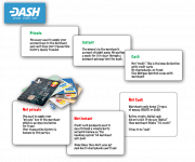
I like this logo. We just need to expand upon it with an infographic/animated infographic. Not to replace it, but to have both. Most people think BitCoin already is digital cash. If we don't combat the misinformation, then we look like a solution in search of a problem. "Who cares, BitCoin has already been around for 6 years, DASH is just another scamcoin."
I don't care if you call it CrapInYourOwnFaceCoin. If there's no definition of what the name is and means, it's a useless branding. We're internalizing again. We, who have been in the project for over a year, understand it fully. We know what it means to say digital cash. Nobody else does. Nobody knows why BTC and it's clones aren't what the misinformation has led them to falsely believe. Yes, it's a bit technical. It doesn't have to be a long-winded every detail thing. If we don't explain it a little, it won't matter what the name is. Just another abbreviation on the Ouija Boards...
Go look at the Tesla website. They break down the basics of an electric car to the point that it's almost deceptive and untrue... But that's what it takes to reach the dumb-masses. Elon is making a shitload of money, so the message must be getting across. I've spoken to many prospective Tesla buyers. They know precisely dick about electric cars or regular cars. Hell, most of them are trust-fund babies that have never worked a day in their lives and can barely spell their own names. They rank among the dumbest people I've ever met. And they're being reached with an infographic style website that almost insults a person with a brain...
http://my.teslamotors.com/goelectric
Does it mention Watts, Amps or Voltage anywhere? It relates to metrics that the dumb-masses can understand even though it borders on dishonesty in order to reach out to them. Is Coefficient of Drag and Frontal Area mentioned? Rolling Resistance? Anything about the motor's construction? Any discussion about inductive reactance? How the LiFePO chemical reaction occurs during charging and discharging? It doesn't talk about any of that. Personally, I wish it did. But, then it would go over the heads of the useless dumbsh!ts it's meant to target...
You mean like this one TokeNormal shared on BCT?

Attachments
I liked that one, except for the fact that it's refering to a video about Bitcoin..You mean like this one TokeNormal shared on BCT?

If we believe we are a serious contender, we better start acting like one.
I found this rather sexually explicitThe D looks like a rocket ship posed for takeoff.