Enzwell
Member
Well, you all have been workin' while I was gone!
The shield thing is kind of interesting. Although it also symbolizes battle and fighting. (?)
I've been going more for the hint of a wave and came up with something I like.
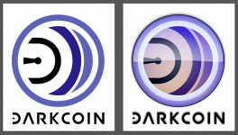
Been trying to stick with the blues of the previous logo. And then decided to try the tacky "candied" version. Never had done that before so I had to look it up and, maybe unfortunately, I kind of like what it did. I'd have to reverse engineer the altered colors, but I kind of like the purple tint and the "warmth of the hearthfire glowing from behind the window shade" thing...
The shield thing is kind of interesting. Although it also symbolizes battle and fighting. (?)
I've been going more for the hint of a wave and came up with something I like.
Been trying to stick with the blues of the previous logo. And then decided to try the tacky "candied" version. Never had done that before so I had to look it up and, maybe unfortunately, I kind of like what it did. I'd have to reverse engineer the altered colors, but I kind of like the purple tint and the "warmth of the hearthfire glowing from behind the window shade" thing...


") . The Dark Gravity Wave silently moving through the crypto universe.
. The Dark Gravity Wave silently moving through the crypto universe.