You are using an out of date browser. It may not display this or other websites correctly.
You should upgrade or use an alternative browser.
You should upgrade or use an alternative browser.
Enhanced Darkcoin Wallet UI
- Thread starter DRKLord
- Start date
- Status
- Not open for further replies.
LittleFinger
Member
NicePersonally I love it, but if it's intended for a broad audience, the key screens that an entry-level user will need to use should be as simple as possible.

We also need to get the opinions of the less technical, not-particularly-darkcoiny end of the intended audience. We might be surprised what they might find confusing or overwhelming.
LittleFinger
Member
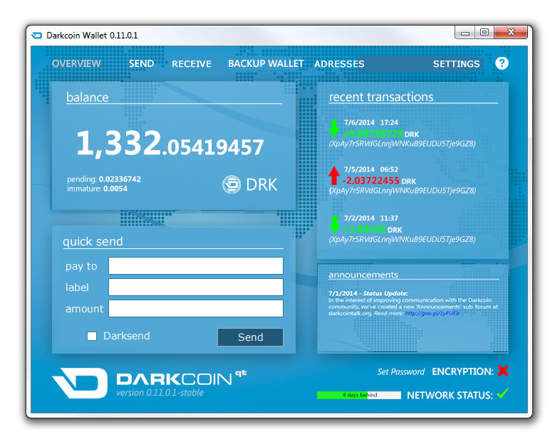
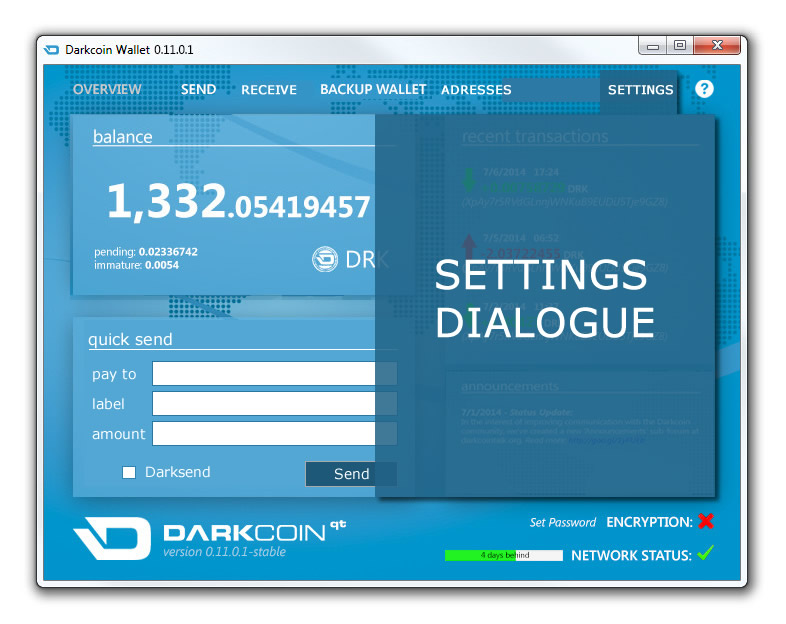
raze I hope you dont mind, I changed up your image a bit. I feel like it would be nice to add a quick send to the front, and still allowing a separate send window for those times when you need to add more than one recipient. Also, things like "Advanced" can be put in the settings window. I moved announcements over to the right, it seems like showing two at a time MAX would be good.
This is very rough, I spent like 10 min moving stuff around. It can still be waay better.
DRKLord I think raze is really onto something.


This is very rough, I spent like 10 min moving stuff around. It can still be waay better.
DRKLord I think raze is really onto something.
Enzwell
Member
We also need to get the opinions of the less technical, not-particularly-darkcoiny end of the intended audience. We might be surprised what they might find confusing or overwhelming.
I could tell you some of that...
Because, honestly... I have NO idea what's going on.
LittleFinger
Member
Well.... luckily for you, the learning curve is low. One use of ANY wallet for ANY coin, and you will understand that its a quick send version of sending darkcoins...Er, sorry LittleFinger but, even just the "Pay to", "Label", "Amount" stuff...
I don't know what that means!! (Well, okay, I know what "amount" means...)
"Pay to, "Label" and "Amount" are all taken from the exact wording of the current wallet.
I didnt add the text inside the input box (the white box to the right of where it says "pay to")
example: "Enter receivers DRK address here" "Enter optional label for this transaction" "Enter amount of DRK to send"
I think you are just trolling me because I didnt stick the god awful coin image in there lol.
Enzwell
Member
I'm sorry... I do know what you mean, to some extent, but, maybe... you don't realize how stupid most people are... 
I'm an old computer graphics geek, so I do get some of this stuff, but this crypto world is *completely* different from running my cable TV box, so I'm lost...
(I'm exaggerating, but only slightly...)
So... what were you saying?
(PS: I have 7 or 8 different wallets, have NEVER traded a dime of crypto, and have *zero* bitcoin... Hardly understand them. Just know that I have 50,000 Givecoin!!!! - Woohoo!!!! I'm rich bitch!!)
Last edited by a moderator:
LittleFinger
Member
Red-Shinobi
Active member
Very nice work Raze. This is the direction to awesome landThis is what happens when I'm suffering from insomnia. LOL

Enzwell
Member
Also...
"Home" should be the first tab... (familiar title from websites)
"Send/receive" could be on one single tab, two columns..
'backup wallet' should be in a "Security" tab, (with sub-tabs? with one for Darksend options?)
"'Addresses" should be in a tab for.. uh... (people?, locations?, destinations?, buyers/sellers?)
Ya'll REALLY have to dumb this stuff down if you want to really meet the masses.
You all just don't realize how "super-geek" you actually are... I'm a partial (though old-school) geek and I still don't get a lot of what you are saying!
LittleFinger
Member
Also...
"Home" should be the first tab... (familiar title from websites)
"Send/receive" could be on one single tab, two columns..
'backup wallet' should be in a "Security" tab, (with sub-tabs? with one for Darksend options?)
"'Addresses" should be in a tab for.. uh... (people?, locations?, destinations?, buyers/sellers?)
Ya'll REALLY have to dumb this stuff down if you want to really meet the masses.
You all just don't realize how "super-geek" you actually are... I'm a partial (though old-school) geek and I still don't get a lot of what you are saying!
The worst thing to do is creating submenus then. Making things hard to find makes the learning curve even harder.
Addresses, is simply supposed to be a rolodex for familiar address. Once you hit that tab, it could take you to its own window where you can label everything.
Tool tips that pop up to explain everything is a better idea than trying to menu-ize everything. Everything should be reachable from the front end.
Yes Back up wallet should def go into the settings tab. And the send receive could fit nicely on one page, with one on top of the other. 2 columns horzontal.
There should be not even a single sub tab, you can get everything right at the users reach without having to create sub sub menus.
Thanks for the feedback everyone! I should probably clarify that my mockup wasn't really intended to suggest any specific functionality, just a suggestion of which direction I think it should go stylistically (although looking at it now while fully awake, there's still a bit I'd like to change in that respect as well).
DRKLord
Member
@ LittleFinger:
No offense was taken, haha! I'm a programmer, not an artist, and I know my design work leaves much to be desired. My post was simply to convey a general idea about the design/layout, which is why it was marked with the bold disclaimer "the wallet will not actually look like this". This was really intended as a "discussion and ideas" thread, and it so far seems to be quite successful in that. I really love the ideas and designs being submitted!
@ raze:
That looks awesome man! We will definitely take your concept into consideration!
Regards,
The DRK Lord
Propulsion
The buck stops here.
Personally I love it, but if it's intended for a broad audience, the key screens that an entry-level user will need to use should be as simple as possible.

We also need to get the opinions of the less technical, not-particularly-darkcoiny end of the intended audience. We might be surprised what they might find confusing or overwhelming.
This is really true. Simple is really better in this regard.
LittleFinger
Member
Thanks for the feedback everyone! I should probably clarify that my mockup wasn't really intended to suggest any specific functionality, just a suggestion of which direction I think it should go stylistically (although looking at it now while fully awake, there's still a bit I'd like to change in that respect as well).
I think its beautiful, and def heading in the right direction. I would go with a slightly darker hue of flat blues. Even though it was a quick mockup, it looks awesome and pleasing to the eye.
THANK YOU!
- Wallet files and private keys can be password-protected at startup
(The rest of it sounds good too!)
A few things that people mentioned:
Balance integers being larger sized than the decimal places - keep it this way for balances >1 and switch it (size-wise) for balances < 1
If giant tooltips are popping up all over the goddamn place, please have some way of turning that off, it would drive me batshit
Longer term and less importantly, save yourself some time trying to please everyone and make it user skinnable, let people have whatever ghastly colour scheme they want and a Select Background Picture dialog...
This look is so awesomeEnzwell Here is an updated version with tooltip and input fields populated by start text.
View attachment 218
Having just read toe Darksend+ announcement, would it be safe (anonymity wise) to add a Consolidate Change button? I know you can do it manually but still...
- Status
- Not open for further replies.
