You are using an out of date browser. It may not display this or other websites correctly.
You should upgrade or use an alternative browser.
You should upgrade or use an alternative browser.
Pre-Proposal - Visual Identity
- Thread starter fernando
- Start date
- Status
- Not open for further replies.
After showing the wife, she likes the Ogilvy one, but not sure about the all capital letters in Dash, most brands have moved to lower case, less shouty.
Anyways here is a quick mockup with lower case. The logo sits better in the Dash when its lower case.

Anyways here is a quick mockup with lower case. The logo sits better in the Dash when its lower case.

Max Yoga
Member
Hi Guys,
My 2c here. Full disclosure - I did introduce Michael and Chris to Ryan/Fernando as branding experts to look at the logo development being done. Dash is a multi-billion market cap digital currency, so our brand identity and positioning needs to reflect this in an appropriate way. My comments below -
1. The Dash brand is not widely known outside the cryptocurrency sector, but within the sector it has a recognisable mark that has gained considerable equity. The 'D' mark with '-' is a very clever and original device - a hint to the 'blockchain' while also mirroring 'C' which indicates 'Cash'. In addition to this, it is minimal while being bold enough to stand out and be seen, for example, a tiny app logo as seen on a hardware wallet, or coin list on an exchange. It would be good if we could retain our heritage in the brand - if you look at other world-leading brands (Ford, Starbucks, McD's etc) you'll note that if the original brand really did stand on its feet and achieved recognition, it was then very carefully tweaked over many years to keep it in line with modern styling. I like that Michael and Chris were humble enough to go 'full circle' on the brand and arrive at the conclusion that the 'D' mark was essential to retain.
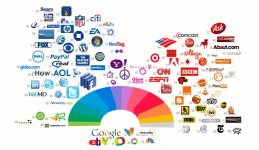
2. The O&M logo has several technical issues - for one, using gradient colours and especially hot pink and electric blue is very seldom used in logos - for good reason (note on my attached file the lack of any logos in that colour space). It is difficult to produce the colour gamut across print/web/mobile and in balance with background images, and the colors clash terribly. Pink and electric blue are non-serious 'funtimes consumer brand' colours (Ben and Jerry's, Tampax from the '90's, Barney the Dinosaur...), NOT colours to build a brand that will be storing your money. See the large colour gaps in the brand colour wheel attached, and the kinds of brands that are close to those colours - there's a reason for that gap and it's not because a 'zany' colour scheme has longevity.
3. In the O&M logo, the DASH font itself in the legend is not balanced, being too tall with mis-spaced kerning between characters. The 'Double D' mark and style and even the colour is not original at all, it is also non-distinct (read: blurry and barely recognisable at a distance) and does not match or balance with the font that the underlying DASH is written in, and furthermore has an unbalanced tilt.
4. The concept of the double-D looks like a pair of shackles (google 'Slave shackles' if you want to see what I mean) - I was particularly not happy about this, as my own project is launching Dash in Africa and I think that even though it is unintentional, once you see it, it's difficult not to make that association.
Will post up more comments/critique in a bit, hope this is helpful.




Max Yoga
Member
Note how clearer and more distinct the single blue 'D' logo is. Even more so than the original. We also completely own the solid sky blue colour space in crypto - a VERY good colour to own.lets do a CMC check
#4: Ogilvy single color | #6: Tharp & Clark | #12 our current logo | #14: Ogilvy gradiant

Chris Clark
New member
Hi! We're really happy to be part of the Dash project and read all the good feedback. Here's an example using the new D icon and wordmark in the same ad campaign concept for you to compare. Thanks!


Chris Clark
New member
And one more featuring the Dashmark

The double D reflects the double tier in our network or two Dash blockchained together.
Your D+C comment reminds me something I didn't mention: whatever logo we decide upon, it will be alive. It will be ours and we will tweak it as we change. Even immediately if we decide so. So focus on the big picture because both reflect two different visions. Details can be ironed out if there is consensus.
Good question raised on Discord, how does it look as a currency symbol?
And if we decide on the O&M symbol, we must have a very good press release ready because we're going to draw a lot of attention from the cryptospace. This press release should very clearly and concisely explain that Dash is much more than a currency but a DAO in which everyone can participate.
Edit: And the colour gradient is going to look awful when printed with amateur equipment, which will be used by most because we're a grass roots organisation
Last edited:
Wilmar Toro
Active member
Although I dislike both new logos. The Oglivy one looks so ugly for me, It doesn't respect the weight of previous identity.
Brands improve/redesign their logos all time, but they preserve their essence, their distinctive character, please look at this:
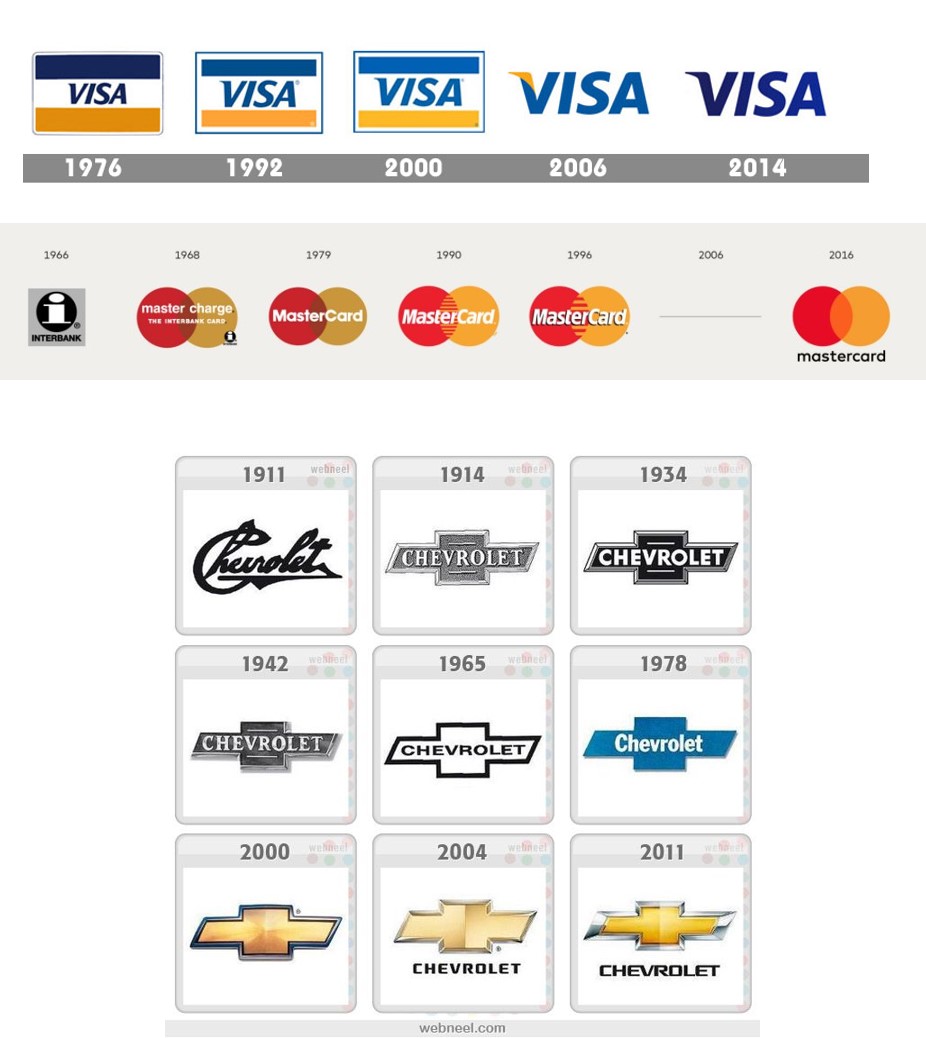
Ogilvy just made something ugly with that color scheme and forgeting all the identity, ¿Also..Why pink?... this reminds me about BitBay or Navcoin
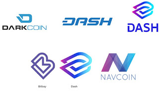
I have to mention, actual Dash logo is awesome, if you look at it fast, you can know It´s Dash, It´s sound, consistent. But if you have to select just one new, Tarp & Clark made the most accurate evolution

Brands improve/redesign their logos all time, but they preserve their essence, their distinctive character, please look at this:

Ogilvy just made something ugly with that color scheme and forgeting all the identity, ¿Also..Why pink?... this reminds me about BitBay or Navcoin

I have to mention, actual Dash logo is awesome, if you look at it fast, you can know It´s Dash, It´s sound, consistent. But if you have to select just one new, Tarp & Clark made the most accurate evolution

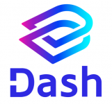
Both logo's shocked me at first sight. But within the hour, I really warmed up to the O&M one, whereas I still dislike the T&C one. I do like @Stealth923 's suggestion to get rid of all capital letters. I also would prefer to have our iconic dashed 'D' be retained somehow. Anyway, since everybody is a designer here  something like this

Hi Guys,
My 2c here. Full disclosure - I did introduce Michael and Chris to Ryan/Fernando as branding experts to look at the logo development being done. Dash is a multi-billion market cap digital currency, so our brand identity and positioning needs to reflect this in an appropriate way. My comments below -
1. The Dash brand is not widely known outside the cryptocurrency sector, but within the sector it has a recognisable mark that has gained considerable equity. The 'D' mark with '-' is a very clever and original device - a hint to the 'blockchain' while also mirroring 'C' which indicates 'Cash'. In addition to this, it is minimal while being bold enough to stand out and be seen, for example, a tiny app logo as seen on a hardware wallet, or coin list on an exchange. It would be good if we could retain our heritage in the brand - if you look at other world-leading brands (Ford, Starbucks, McD's etc) you'll note that if the original brand really did stand on its feet and achieved recognition, it was then very carefully tweaked over many years to keep it in line with modern styling. I like that Michael and Chris were humble enough to go 'full circle' on the brand and arrive at the conclusion that the 'D' mark was essential to retain.
2. The O&M logo has several technical issues - for one, using gradient colours and especially hot pink and electric blue is very seldom used in logos - for good reason (note on my attached file the lack of any logos in that colour space). It is difficult to produce the colour gamut across print/web/mobile and in balance with background images, and the colors clash terribly. Pink and electric blue are non-serious 'funtimes consumer brand' colours (Ben and Jerry's, Tampax from the '90's, Barney the Dinosaur...), NOT colours to build a brand that will be storing your money. See the large colour gaps in the brand colour wheel attached, and the kinds of brands that are close to those colours - there's a reason for that gap and it's not because a 'zany' colour scheme has longevity.
3. In the O&M logo, the DASH font itself in the legend is not balanced, being too tall with mis-spaced kerning between characters. The 'Double D' mark and style and even the colour is not original at all, it is also non-distinct (read: blurry and barely recognisable at a distance) and does not match or balance with the font that the underlying DASH is written in, and furthermore has an unbalanced tilt.
4. The concept of the double-D looks like a pair of shackles (google 'Slave shackles' if you want to see what I mean) - I was particularly not happy about this, as my own project is launching Dash in Africa and I think that even though it is unintentional, once you see it, it's difficult not to make that association.
Will post up more comments/critique in a bit, hope this is helpful.
View attachment 6651 View attachment 6647 View attachment 6648 View attachment 6649 View attachment 6650
Well, if the original dash logo can evolve over time, why can't the new dash colors evolve over time? Indeed, the solid color variations provided by O&M are good and usable alternatives.
O&M's logo is not so original - these interlocking link logos are two-a-penny - but the stats, and my eyes, tell me it's better than yours. Sorry, I realize that sounds harsh, and I appreciate your effort, but from where I'm standing it's a done deal. My only other thought is that we go to a completely different design branding company and try again, but I doubt many MNOs would be up for that.
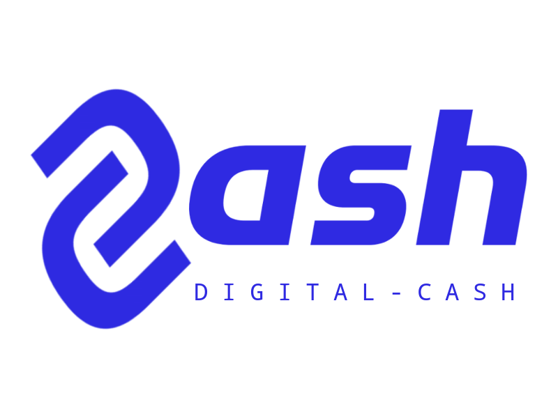
If you want the evolution of a logo, using the new brighter blue...
technoir
New member
Note how clearer and more distinct the single blue 'D' logo is. Even more so than the original. We also completely own the solid sky blue colour space in crypto - a VERY good colour to own.
I wouldn't say we own blue, Ripple and Cardano are both using blues similar to ours and sadly they have higher CMC rankings.
TaoOfSatoshi
Well-known member
My thoughts:
- At first glance, hated them both.
- Had breakfast, returned to the computer and the O&M one started to grow on me.
- O&M design looks clean and professional.
- The colours do a good job of making the logo appeal to both a male and female audience.
- The transition of colours from one side to the other does a good subliminal job of the send function from one party to the other.
- I could have made the other one, it is a lesser version of the current one. You do not want to vote for something that I could have created!
Overall, I choose O&M, and would be excited to see it roll out!
Tao.
amanda_b_johnson
Well-known member
The O&M logo says "Hi, we're a company, and we've got a little icon next to our name to prove it." The T&P logo says "There's a new way to pay, and it's called Dash."
Dash is not a company. What's more, the T&P logo has a potential Unicode "D" symbol baked right in, which both preserves the spirit of the current logo and gives a handy currency symbol.
So I vote for T&P's design.
Dash is not a company. What's more, the T&P logo has a potential Unicode "D" symbol baked right in, which both preserves the spirit of the current logo and gives a handy currency symbol.
So I vote for T&P's design.
Last edited:
trust_thyself
Active member
I had hoped that with the time and coin put into this rebranding what was put-forth would immediately be well-received. That didn't happen, at least for me, but perhaps it may as the options germinate a bit longer.
That said, I still like the font used in the original Darkcoin logo. Clean, tech/future-oriented.
Really cool to see the comments/logo tweaks made by others here on the forum thus far! What a creative bunch.
That said, I still like the font used in the original Darkcoin logo. Clean, tech/future-oriented.
Really cool to see the comments/logo tweaks made by others here on the forum thus far! What a creative bunch.
Tharp & Clark
1. Continuity
2. Slightly Softer and less (robotic as they say) edgy version of what we already have
3. Easy to put on T-shirts and letterhead and hats and bags and everything else
4. I always felt like that D with the little hash in the center of it was a brilliant concept. It can be a visual of someone handing cash into a bucket or it can lead you into reversing the D into a C in your mind. Brilliant.
5. Apparently I agree with Amanda - which is reason enough to go with Tharp and Clark
Too bad I don't get an official vote! I look forward to seeing where you all take it and love the comments here. So glad to see this process bearing some fruits.
...or someone inserting their middle finger into a D
- Status
- Not open for further replies.
