LimLims
Member
From this thread: https://bitcointalk.org/index.php?topic=421615.msg5852760#msg5852760
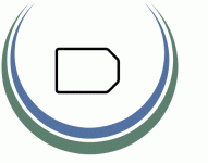
As per the timeline here, first step is getting some crowdsourced logos to pick from. I currently have 272 DRK redirected from bounties for this, and I need around 600 to kick this off.
Currently at 358 / 600 DRK for logo design.
Xc8xGSP7FwWGPQpgw298z7NYdA8xJK8ooh
As per the timeline here, first step is getting some crowdsourced logos to pick from. I currently have 272 DRK redirected from bounties for this, and I need around 600 to kick this off.
Currently at 358 / 600 DRK for logo design.
Xc8xGSP7FwWGPQpgw298z7NYdA8xJK8ooh
")
")