Logo discussion

godzirra

New Member
Mar 28, 2014
34
2
8
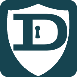
Love the shield and lock idea. Ditch the common circle. When people see the shield at a glance they'll recognize it. only suggestion I have is the color scheme. Blue on dark blue kind of doesn't complement each other and doesn't pop. I like the original colors of blue and silver or blue and gold. Could we see some different color combos? Great work by the way. Super creative and clean.
 

altobase

New Member
Mar 6, 2014
2
0
1
Man this is definitly my favorite concept so far in my thread. Simple, good looking, and gets across the point of darkcoin pretty well. However, im not sold on the color scheme. Try adding colors that are a bit brighter, and have the colors be more contrasting, because right now its a bit muddy and does not pop enough.
Maybe you should also try adding an outline to the shield.
 

patrolman

Member
Mar 9, 2014
102
67
78
www.dash.pics
Seems like everyone is keen for Raze's design. I'm going to keep adding a few anyway. The last one I added was pretty quick and I think is maybe a bit congested, so I simplified a bit and applied the same design to the key. I've also provided a non-circular design.


ErrorId

Member
Mar 9, 2014
158
41
88
Canada
I thought on the keys for a moment and what comes to my mind is that a key opens things and we want the opposite.
 

zXm

New Member
Mar 22, 2014
19
2
3
I agree. A key does not make a great deal of sense to me as a logo for DRK. I am also curious as to why people seem to prefer a shield to a lock? Or the shield-lock design? What does a shield tell you about DRK that a lock does not?
 

godzirra

New Member
Mar 28, 2014
34
2
8
The lock to me says private. The shield represents protection. It hits the nail on the head. I personally like the color gold or silver to denote money or value as well.
 

raze

King of the Morlocks
Foundation Member
Masternode Owner/Operator
Mar 9, 2014
337
372
233
Dash Address
Xtrdw361DvoyDhxL5XoeAvTxTPvM4dXuLW
only suggestion I have is the color scheme. Blue on dark blue kind of doesn't complement each other and doesn't pop. I like the original colors of blue and silver or blue and gold. Could we see some different color combos? Great work by the way. Super creative and clean.
 
  • Like
Reactions: godzirra

godzirra

New Member
Mar 28, 2014
34
2
8
View attachment 24
Ok last one since everyone seems to like the shield idea.
I actually like this shield better. More English the others remind me more of Viking. But whatever I'm nitpicking. This one has a bit too much going on. Not as streamlined and simplistic. I like the simplest possible.
 
Last edited by a moderator:

godzirra

New Member
Mar 28, 2014
34
2
8
Raze I really like the blue and gold. Can you make the gold more bright? Less mustard? And the "coin" in the same blue as the shield. So there's only two colors. To be honest your design is the best I've seen so far by a lot.
 

godzirra

New Member
Mar 28, 2014
34
2
8
Maybe Raze the Colors could be reversed. The "DARK" could be blue and the "COIN" gold. That might make more sense. This should get posted @bitcointalk too so more heads can input. Great job dude. I think you should get the bounty instead.
 

TanteStefana

Grizzled Member
Foundation Member
Mar 9, 2014
2,876
1,866
1,283
I agree. A key does not make a great deal of sense to me as a logo for DRK. I am also curious as to why people seem to prefer a shield to a lock? Or the shield-lock design? What does a shield tell you about DRK that a lock does not?
It represents protection

Love the blue and gold, it's different.
godzirra has a good point too, would love to see the colors opposite :) dang, you guys are honing it down!

What do you think LimLims?
 
Last edited by a moderator:

raze

King of the Morlocks
Foundation Member
Masternode Owner/Operator
Mar 9, 2014
337
372
233
Dash Address
Xtrdw361DvoyDhxL5XoeAvTxTPvM4dXuLW
Maybe Raze the Colors could be reversed. The "DARK" could be blue and the "COIN" gold. That might make more sense. This should get posted @bitcointalk too so more heads can input. Great job dude. I think you should get the bounty instead.
Thanks. I'm just trying to throw ideas out there. Not really concerned about winning the bounty. I'm curious to see the designcrowd results.
 

ErrorId

Member
Mar 9, 2014
158
41
88
Canada
Thanks. I'm just trying to throw ideas out there. Not really concerned about winning the bounty. I'm curious to see the designcrowd results.
Hey Raze what if you moved the D over to the left a little into the other side of the shield so the middle line of the shield lines up with the inside straight line of the D. I'd attempt it myself but don't have the skills. :(
 

zXm

New Member
Mar 22, 2014
19
2
3
It represents protection
That's what I think too, which is why I also think I have a problem with it. It seems redundant because privacy (signified by the lock) is protection. Furthermore, a shield with a keyhole in it doesn't really make sense: it isn't a real object or modeled on anything that would have uti beyond the fact that protection and privacy are related concepts.

I really like the idea of using gold or some kind of yellow for the word coin for the obvious reason, but also because it is a lighter color.
 

godzirra

New Member
Mar 28, 2014
34
2
8
The shield is appropriate because it's a defensive weapon. Like the last line of defense. It seems like a good symbol for darkcoin. And it is very distinguishable from every coin logo to date. As a matter of fact I don't know what the symbols for most coins even mean. The shield with the lock sends people a quick clear message.
 

raze

King of the Morlocks
Foundation Member
Masternode Owner/Operator
Mar 9, 2014
337
372
233
Dash Address
Xtrdw361DvoyDhxL5XoeAvTxTPvM4dXuLW
Hey Raze what if you moved the D over to the left a little into the other side of the shield so the middle line of the shield lines up with the inside straight line of the D. I'd attempt it myself but don't have the skills. :(
I tested it, but really wasn't getting very good results. I think the "D" gets a bit lost and ends up looking kind of "P"-ish. Plus it leaves the lock design unbalanced with the keyhole part getting squished on the left side of the shield and leaves too much empty space on the right...unless I misunderstood your idea.
 

ErrorId

Member
Mar 9, 2014
158
41
88
Canada
I tested it, but really wasn't getting very good results. I think the "D" gets a bit lost and ends up looking kind of "P"-ish. Plus it leaves the lock design unbalanced with the keyhole part getting squished on the left side of the shield and leaves too much empty space on the right...unless I misunderstood your idea.
Just tried it and I see what you mean with it looking p-ish.
 

Taurine

New Member
Mar 28, 2014
5
0
1
darkcoin6.png

Colors the same as the coin, vectorable, and closer to the same "D" thats on the coin face.
 

zXm

New Member
Mar 22, 2014
19
2
3
The shield is appropriate because it's a defensive weapon. Like the last line of defense. It seems like a good symbol for darkcoin. And it is very distinguishable from every coin logo to date. As a matter of fact I don't know what the symbols for most coins even mean. The shield with the lock sends people a quick clear message.
I suppose I am in the minority, but I think the lock does the job quite well without the shield. I liked raze's original design best, thus far, though I would like to see it in other colors (especially the gold). Taurine's, there's something about yours that I find appealing. But I thought about it and the shield is protecting the key, which then exploits the keyhole in coin. Not sure if that is ideal. Regardless, keep them coming.
 
Top Bottom