• Forum has been upgraded, all links, images, etc are as they were. Please see Official Announcements for more information

Pre-Proposal - Visual Identity

Status
Not open for further replies.
Evolution of Dash visuals - Vote for freedom

Background

The community has recently been presented with 2 options for a new Dash logo.

- The first was commissioned from O&M and paid by Dash Core then revealed to the community.
- The second appeared mysteriously around the same time from T&C.
- The O&M solution was broadly rejected.
- That left the T&C option which received mixed responses - however out of the two, was deemed preferable and has now qualified for funding.

Concerns:


- It looks like we'll be changing the most fundamental visual element of the Dash brand with an option decided on the basis of it being the 'safer of 2 options'.
- Because there was no announcement or invitation to submit proposals - only 1 company had an opportunity to do so. Choice is vitally important when considering something as important as a logo.
- We also believe that it is unwise to deploy a new logo in isolation to the broader brand. Dash is broad and complex eco-system that has continuity issues. There is great scope to improve not just the logo but how the broader dash world all ties in, with an newly refreshed logo sitting on top of all that.
 
The Double D simply doesn't work in my opinion. I understand the progressive evolution of logos but there simply isn't anything to justify it. The chain can be represented in much better graphic ways, but it's an already seen logo. See Chaincoin as just one example!
 
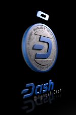
The new logo needs to be fixed. Though better than the O&M attempt, it's got problems.

The dashmark should be more unique and alien.
The D needs a straight part on it's right to sync/solidify the angle with the rest of the logo.
The "a" is terrible. It "gets stuck in my eye".
Needs to be a bit thicker again.
The 10 degree slant is too boring. 12 degrees should be a minimum, maybe up to 16 degrees. (Old logo was at 18 degrees.)
(And you can use 12, 14 or 16 degrees, depending on your taste, design, and/or target audience.)

This is 12 degrees on top (wht bg), and 16 degrees (blk bg).

[Also, it only costs 21 Dash!]

D2018bw2.png
 
Status
Not open for further replies.
Back
Top