• Forum has been upgraded, all links, images, etc are as they were. Please see Official Announcements for more information

Pre-Proposal - Visual Identity

Status
Not open for further replies.
I want to remind everybody that OP wrote

> Ogilvy has offered to do a reinterpretation of the current logo as part of their work, so we could do that if this were the result.

I would like to see the result of that.
 
"noun: Dao
  1. (in Chinese philosophy) the absolute principle underlying the universe, combining within itself the principles of yin and yang and signifying the way, or code of behavior, that is in harmony with the natural order."
 
Perhaps this too obvious but... this icon = digital cash
dash-dc.png
 
I would welcome a shift from the uber-masculine, all-caps, battleship theme of DASH in our current brand to a more neutral and female-friendly brand like what T&C has offered. O&M seems to be a pendulum swing too far into feminism (with an impractical gradient theme that, while initially striking, seems cheap with time). T&C is a nice critically-damped transition from our existing theme into a comfortable middle ground. It respects our past and prepares our future.
 
Last edited:
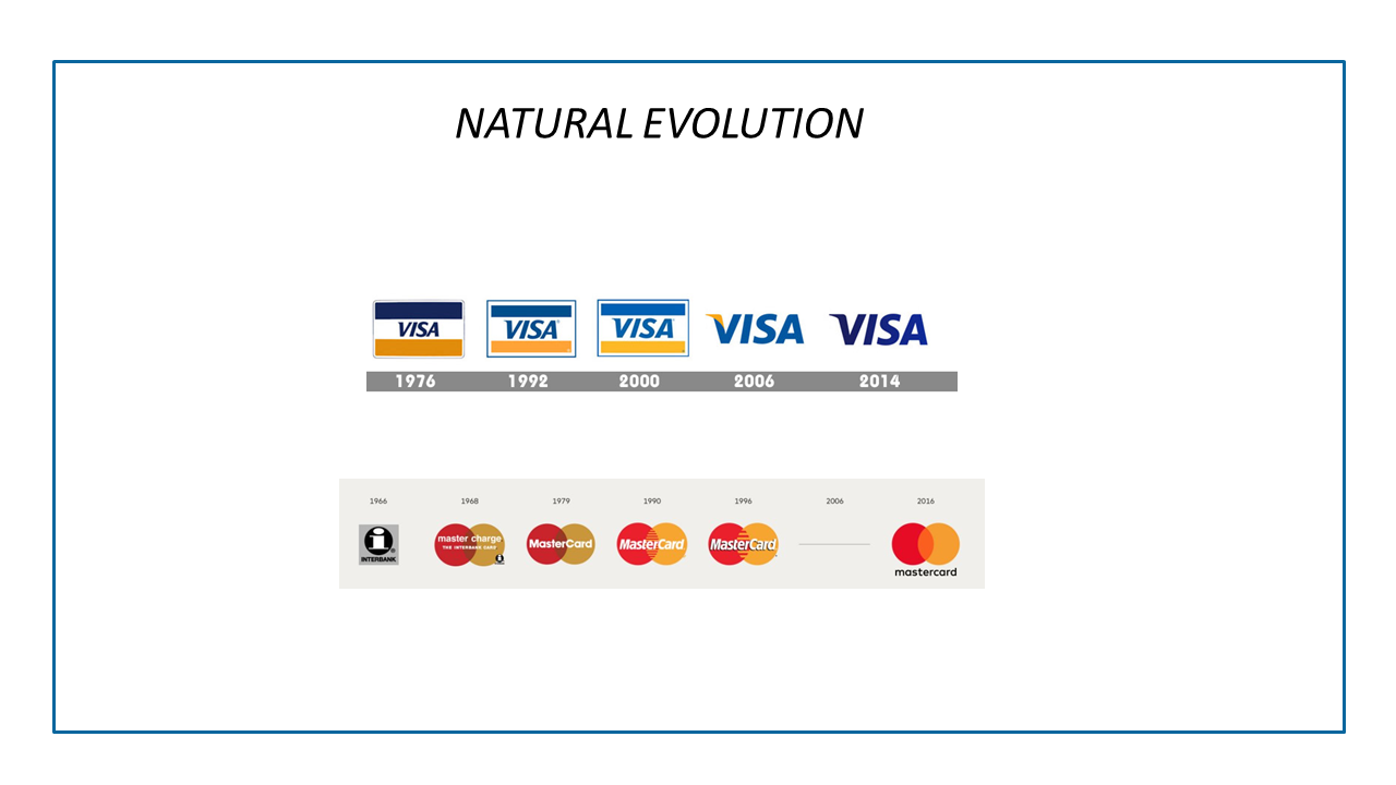
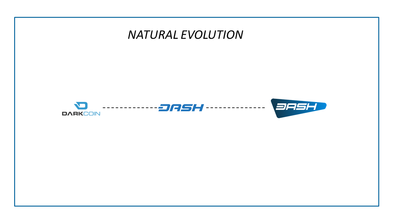
I don't think any of this need to happen now. It will cause all kinds of problems without much (if any) benefit. There are plenty of well put comments against making changes (such as the one with Amanda's video), so I will no go on about it. If for some reason we are really itching for a new logo as a community, then let me just say I'd rather be evolutionary, rather than revolutionary.

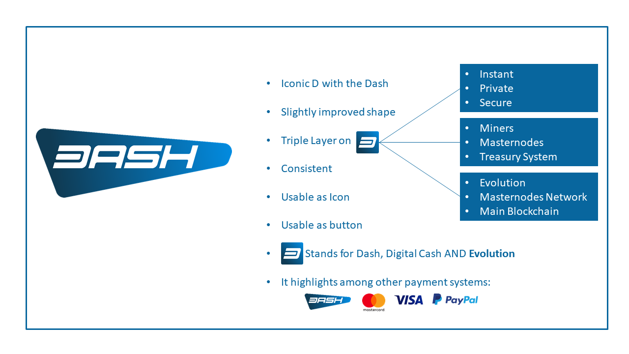
My quick mock-up of a slightly softer logo.
Dash_Logo_Evolution.png

Ha! Nice! I did the same thing yesterday when I was making that last one, but didn't want to overplay the point (and, it's a little wacky)...

DashTxtC.png
 
After sleeping on the new logo pre-proposal - visual identity. I now know what the O+M color palette used reminds me of. The colors used are very progressive aren't they in the gender identity political sense. A bit too feminine for my liking.

Well that's approximately half the population of humanity discounted for... How do we go about eliminating the rest?

Walter
 
Do we need to improve our current logo? maybe, this is complex issue.
Do we need to prepare Dash for Evolution? Yes
Do I believe in keeping Dash' valuable identity? yes
AA1.png

AA2.png

AA3.png
I'm not interesting in voting for BASH. WTF is BASH?

Walter
 
One day later, I agree that the current logo is really great, and the "a" T&C logo is a bit undefined. The Dash "D" truly is iconic, or will be once the product is actually usable by everyone (more work on this please) and the forward leaning makes it look like it's really fast. I do like the softening of the corners as seen below, (attachment 6705, second image) but that's it.

The Dash "D" isn't truly "Iconic".. 99% of the world population doesn't even know it exists..?

Neil Armstrong = Iconic
Bill Gates = Iconic
Steve Jobs = Iconic
The Beatles = Iconic

Dash Digital Cash = Who?

Walter
 
- The data to support the O&M logo is pretty low quality imo, even their truly horrible logo #3 fared much better than our current logo in the tests they used which should set alarm bells ringing.

Why? Why should it set alarm bells ringing? Is our current logo immune from the forces of popular opinion?

Walter
 
Last edited:
we must be the community with the most Graphic Designers / Creative Directors everrrr :D
 
  • Like
Reactions: JOL
After thinking about for the last day or so, I still think the Ogilvy logo is the best choice for Dash moving forward. I won't be angry if Tharp or the current logo is chosen, just disappointed. I want to see the look of Dash reflect the change, innovation, and growth taking place in the rest of the community.

Ogilvy is confidently blazing a new path forward, Tharp is timidly moving sideways trying to cling to the past.


That said, I wouldn't mind seeing some alternate color schemes from Ogilvy.
 
When I saw the Africa and Venezuela slides on the T&C, I was sold, Not only is their design better in my opinion, they understand Dash.
 
The thing is, the Dash "D" is NOT iconic. We don't have enough Dash users yet for it to be even close to iconic. However what it *is*, is simple and also unique, which makes it work well as a currency symbol, it scales down well to a small size, and has potential long-term mileage. IMO, the biggest downside to O&M is that there's really no replacement for the Dash "D".
 
Oh gosh, I hate to say it but I really dislike both of them very much and prefer what we have. Sorry.

Don’t be sorry. I appreciate this kind of honesty. Personally the Ogilvie Mather looks like some children’s toy design or something they still from someone at burning man. Ridiculous. €88,000 they paid for this? That is hilarious.

The second one is subtle clean and recognizable so people will connect it to our current logo which I actually think is just fine. I would go with the second one hands-down if anything. I’m sure they are giving a better deal too [emoji41]


Sent from my iPhone using Tapatalk
 
Status
Not open for further replies.
Back
Top