• Forum has been upgraded, all links, images, etc are as they were. Please see Official Announcements for more information

Enhanced Darkcoin Wallet UI

Status
Not open for further replies.
imho, the official qt should be as simple as possible...... only enough to serve the functions necessary. third party wallets can get as fancy as they want..

the only thing wrong with the current qt is that darksend is checked by default, i think it should be off by default.

Like daaarkcoins, I disagree with this. Every transaction should be completely anonymous...after all, this is DARKcoin. I think the only reason there ever was a checkbox in the first place was because Darksend was a new/experimental feature. Ultimately it won't be new or experimental...and should ALWAYS be used.
 
Like daaarkcoins, I disagree with this. Every transaction should be completely anonymous...after all, this is DARKcoin. I think the only reason there ever was a checkbox in the first place was because Darksend was a new/experimental feature. Ultimately it won't be new or experimental...and should ALWAYS be used.


fair argument.. my statement stems from the current behavior and I get an error everytime I send coin.
 
Was there ever a formal decision made on the official logos for Darksend and Dark Gravity Well? If so, could anyone point me to the graphics? I think it'd be cool to display them in the load/splash-screen of the wallet.
 
Was there ever a formal decision made on the official logos for Darksend and Dark Gravity Well? If so, could anyone point me to the graphics? I think it'd be cool to display them in the load/splash-screen of the wallet.
I agree, although it would nice if there were a way of disabling the display of the load/splash screen. Not a big deal though! :smile:
 

Personally I love this, the exchange concept could be a very useful feature, especially if it was decentralised and anonymous, but, but how would it be implemented?

It's one hell of a mission to implement, then you have need to store multiple currencies within the Darkcoin wallet. Eg. you cannot exchange with bitcoin unless it's also in the wallet.
 
I think that some of the users have hit the nail on the head in my opinion. DRKLord, Im betting that the conclusion you will ultimately end up at, is that the official wallet needs to be as simple and bulletproof as possible, showing only the features that 98% of the population would care about.

If it were me, I would at most, bring a design update to the wallet. Maybe a flat ui style and then I would start working on a 3rd party solution that includes all the widgets and gadgets. You are probably in the best position a person can be to ensure the official wallet is simple and rock solid, with an advanced wallet option, because you would be working on both if that is how you approach it.

Obviously DRK is a much different coin than most, and has features that will need to be represented in the official wallet, but I wouldnt jam pack it with a bunch of other stuff.
 
Looks very very very nice man. I Realy like the idea of the network statistics.

this truly shows darkcoin is a unique coin. Even litecoin is a bitcoin clone, but darkcoin is showing its different (same as darksend)

Thanks for your work. would like to see the download soon :)

adriaan
 
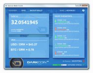
After listening to everyone's suggestions, I totally re-thought the entire design and came up with a new look...

Keep in mind this is just "programmer art"... temporary artwork used as a place-holder until a more skilled artist can do a proper design for a release quality version. But hopefully this will give you an idea of what I now have in mind.

MockUp_01.jpg


NOTE: This is NOT a finished product and the actual wallet update released will NOT actually look like this. This is a mock-up / concept design!

So far I've loved all of the suggestions that have been made and hope to hear a lot more! I've already decided to incorporate some of your suggestions into the final design specification, such as:

  • Overview page will be clean, simple and clutter-free
  • Wallet will have a "simple" display mode and an "advanced user" or "nerd-mode" display mode
  • Loading / splash-screen will be made optional, perhaps with a -suppress_splash command line option
  • Wallet will be more configurable and customizable to suit your personal preferences
  • Wallet will display detailed information about your masternodes and their status, earnings, etc
  • Wallet files and private keys can be password-protected at startup
  • Will be working on an auto-update feature, with security a prime consideration

Hope everyone else is excited as I am to have a much more attractive, functional and versatile wallet platform for our coin and I'm still open to hearing your suggestions! I will do my best to hear every voice and serve our community. :)

Regards,

The DRK Lord
 
It looks a lot less ugly without the "filler content" in the Overview tab page... I think the "frame" of the design/layout itself doesn't look so bad!

MockUp_02.jpg


What do you say? :cool:

-- The DRK Lord --
 
DRKLord, I love you to death man, but no way lol.

Have someone create a design for you, even if it includes things that arent part of the wallet, this way you can see the elements.

Take these pics for an example that I just downloaded. (They have nothing to do with wallets but shows how someone can create an element palate for you to work from)

website-template.jpg Flatastic_Mobile_Free_Flat_Photoshop_PSD_UI_Kit_Template.jpg flat-ui-free.jpg

This way you can work on the backend, and then incorporate the front end once you are done test. If you put the word out and asked for help, Im sure someone would spend a day creating an element design that you can work from.

Please understand, whether I am correct or wrong, its just coming from a good place. I dont mean to sh*t on your designs. Also, I am just talking about the design aspect, Im sure the features discussion would be better served by you and others.
 
Last edited by a moderator:
Let's not get too hung up on what it looks like. To me, usability is more important. I would like to see the number of masternodes connected in the network info section. Also make it easier to use Darksend. A lot of less technical users don't need to know about selecting inputs when doing a darksend. Maybe have an expert view and simple view for the UI? To widen the appeal and use of Darkcoin, it needs to be usable by your granny :)
 
That looks extremely awesome, raze!

Edit: You guys may wanna check out the -splash=0 command line switch ;) or put splash=0 in your config.
 
This is what happens when I'm suffering from insomnia. LOL
prHc9do.jpg
Yeeeah boi!!

Now thats a lot closer to the times. (By "The Times" I mean that alot of apps and programs have adapted to show pertinent information, and we are at a time where "intuitiveness" has increased. Thanks to products like tablets and smart phones, where devs had to learn to adapt to only having so much surface area.)

DeathRay1977 I wasnt just trying to focus on design, so much as voicing my opinion in the hopes we could bring it out of 2002. I too would like it to display masternode information, also to make darksend easier to use. Nail on head in my opinion.

DRKLord, I wasnt trying to insult you in the least. I think that you know what my intentions were. With the adoption of smartphones, we have entered the era of user intuitiveness by being forced to adopt to smaller screens. This includes bigger buttons, and displaying only the important information. Maximizing space and creating navigation is easy to interpret.

raze I would switch the announcements with the balance, and give the announcments less space. Its important but if a user needs to see it, maybe it could expand a bit. Or even place announcements above transactions and leave the top left for balance, and the bottom left for other features related to sending. As far as I can tell, Sending coins doesnt need its own page/window. if you look at the current qt, its basically one big empty page.
 
Last edited by a moderator:
This is what happens when I'm suffering from insomnia. LOL
prHc9do.jpg

Meh.
(Actually, not bad Raze, good job, but still... you're thinking to hard. And you might be insulting people in the future, who have less than 1 DRK. Don't make the characters smaller after the decimal point. (?) There are too few Darkcoins!)
"Balance" should be above "Announcements" (what's most important thing for most people? Unfortunately, MONEY!! So, the next thing should probably be DRK/USD and DRK/BTC current values, not the "news", that's still a crypto-geek thing, most people don't care about that!),
and there should be *ZERO* graphics-transparency in the interface (that uses up to much processing power, esp. on a phone), and of course, hue is too much like NXT (as always, to me), go more blue! And use the coin graphic, people seem to like it, and it's much cooler than just the logo-D, (I heretofore release my coin graphics as CC-BY-ND, if that's what you're worried about).
...
Not that this tweak is anywhere near perfect.. but here's a couple ideas...
intfcrzfx3-jpg.204


Anyway, there's my obnoxious opinion! :D
 

Attachments

  • IntfcRzFx3.jpg
    IntfcRzFx3.jpg
    117.3 KB · Views: 256
Damned Photoshop layers!
There was suposed to be a "NEWS" text/tab between the "Backup Wallet" and "Basic/Advanced" tabs.
 
Meh.
(Actually, not bad Raze, good job, but still... you're thinking to hard. And you might be insulting people in the future, who have less than 1 DRK. Don't make the characters smaller after the decimal point. (?) There are too few Darkcoins!)
"Balance" should be above "Announcements" (what's most important thing for most people? Unfortunately, MONEY!! So, the next thing should probably be DRK/USD and DRK/BTC current values, not the "news", that's still a crypto-geek thing, most people don't care about that!),
and there should be *ZERO* graphics-transparency in the interface (that uses up to much processing power, esp. on a phone), and of course, hue is too much like NXT (as always, to me), go more blue! And use the coin graphic, people seem to like it, and it's much cooler than just the logo-D, (I heretofore release my coin graphics as CC-BY-ND, if that's what you're worried about).
...
Not that this tweak is anywhere near perfect.. but here's a couple ideas...
intfcrzfx3-jpg.204


Anyway, there's my obnoxious opinion! :D
Im not sure thats better, not that my opinion matters.

Also, how much processing power do image transparencies actually require? lol It seems to me the numbers after the decimal can easily be made bigger (dynamic) if the person has less than a full DRK. It looks better with the numbers after the character smaller, when there is at least a full DRK in the wallet, to me at least.

Im pretty sure any phone app is going to use a different source entirely, even if it is a windows phone. I agree the blue should be just a hair darker, not much at all though.

Let me open up my image editing program and see if I cant whip something up using his original file. I think raze is on to something.
 
After listening to everyone's suggestions, I totally re-thought the entire design and came up with a new look...

Keep in mind this is just "programmer art"... temporary artwork used as a place-holder until a more skilled artist can do a proper design for a release quality version. But hopefully this will give you an idea of what I now have in mind.

View attachment 194

NOTE: This is NOT a finished product and the actual wallet update released will NOT actually look like this. This is a mock-up / concept design!

So far I've loved all of the suggestions that have been made and hope to hear a lot more! I've already decided to incorporate some of your suggestions into the final design specification, such as:

  • Overview page will be clean, simple and clutter-free
  • Wallet will have a "simple" display mode and an "advanced user" or "nerd-mode" display mode
  • Loading / splash-screen will be made optional, perhaps with a -suppress_splash command line option
  • Wallet will be more configurable and customizable to suit your personal preferences
  • Wallet will display detailed information about your masternodes and their status, earnings, etc
  • Wallet files and private keys can be password-protected at startup
  • Will be working on an auto-update feature, with security a prime consideration

Hope everyone else is excited as I am to have a much more attractive, functional and versatile wallet platform for our coin and I'm still open to hearing your suggestions! I will do my best to hear every voice and serve our community. :)

Regards,

The DRK Lord
I like this. It has everything anyone would want but displays the most needed stuff on first tab. I don't think you need the latest transaction details in two places though, just on the upper right. The news and alerts should just be that, no transaction details. I know nothing of graphic design, so I suppose it could be improved via layout and font, but for me this would be perfect ;P

Just a note, I have always hated having the blues of the website and the blues of the coin together. They clash in my eyes, sorry!
 
Personally I love it, but if it's intended for a broad audience, the key screens that an entry-level user will need to use should be as simple as possible.

simplicity.png


We also need to get the opinions of the less technical, not-particularly-darkcoiny end of the intended audience. We might be surprised what they might find confusing or overwhelming.
 
Status
Not open for further replies.
Back
Top