You are using an out of date browser. It may not display this or other websites correctly.
You should upgrade or use an alternative browser.
You should upgrade or use an alternative browser.
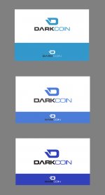
Blue vs B&W Logo
- Thread starter LimLims
- Start date

DieCommieScum
Member
Tough decision, but had to go with B+W as the blue just kinda made me think of Coinbase.
Propulsion
The buck stops here.
Darker blue?
blue invokes trust, that's why a lot of financial institutions use it, like chase, Prudential, Alliance, etc.. and B of A (mostly blue with a bit of red) I think grey really doesn't cut it. It would be a nice compromise to at least get color instead of black and grey.
Enzwell
Member
Yea. It's a little too cyan?Darker blue?
I can't decide!!
NameUser
New member
Where is Enzwell's submission? Are these really the only options we have? I remember seeing a variant with a keyhole for instance. Also, is it too late to have the original designer submit more variants? I must agree with patrolman - this seems rushed. Keep in mind that we are in different time zones as well.
I think we should allow more of the DRK community to catch up and get on this forum. Only 242 registered members so far. Let's not rush this so people start rebel against the winner at a later date.
I think we should allow more of the DRK community to catch up and get on this forum. Only 242 registered members so far. Let's not rush this so people start rebel against the winner at a later date.
Kai
Active member
+1Where is Enzwell's submission? Are these really the only options we have? I remember seeing a variant with a keyhole for instance. Also, is it too late to have the original designer submit more variants? I must agree with patrolman - this seems rushed. Keep in mind that we are in different time zones as well.
I think we should allow more of the DRK community to catch up and get on this forum. Only 242 registered members so far. Let's not rush this so people start rebel against the winner at a later date.
LimLims
Member
I don't think this is rushed -- we've been considering this logo and its variants for some time, several variants have been proposed, and these two have remained clearly above the pack. That's a good thing -- it means we're narrowing down our collective preferences. Honestly we could deliberate & come up with minor variations forever, but after a point we start to see diminishing returns. For me, now is a natural point to make a decision about the two frontrunners from the past week.
I would also like to make it clear that there are a number of voices in the community who are calling for the logo to be finalised, so I'm considering their opinions alongside the ones being expressed here. I've given the discussion more time than I expected we'd need, so that was a compromise to allow a bit extra time to see if any other strong design variants came out.
If someone submits something to the level of quality of these two before the vote is closed, I'll consider calling a revote, but it's going to really have to stand out. A non-binary vote is really not ideal.
Kai
Active member
@LimLims why not keep all color variations ? (see my post in the other thread, look at those made by @NameUser http://imgur.com/a/jvVpL)
LimLims
Member
@Kai
Reason 1: I seriously doubt anyone wants an elimination tournament, which is the only fair way to conduct such a vote. It would take 1-2 weeks just to complete the polls, and in all likelihood the final would end up with these two up against each other.
Reason 2: A number of those colour schemes you linked to are not worth putting to vote. I'm not interested in adding noise to the discussion at this point.
If the majority of people disagree on point 1., I'm open to conducting an elimination tournament.
Kai
Active member
Now I'm confused I think he posted those variations because you said that there was only the blue one.@Kai
Reason 1: I seriously doubt anyone wants an elimination tournament, which is the only fair way to conduct such a vote. It would take 1-2 weeks just to complete the polls, and in all likelihood the final would end up with these two up against each other.
Reason 2: A number of those colour schemes you linked to are not worth putting to vote. I'm not interested in adding noise to the discussion at this point.
If the majority of people disagree on point 1., I'm open to conducting an elimination tournament.
 It's an idea, the designer of the logo can easily make those changes. Moreover, I don't talk about an elimination tournament on the contrary I'm telling you to keep all the color variations, they can be great e.g. for t-shirts.
Last edited by a moderator:
I think it's important to keep an official color scheme in order to keep the branding consistent and professional. You don't want the website blue, Reddit red and darkcointalk orange, for example. That not to say that people can't create unofficial color variations for t-shirts or whatever, but I don't think that's really the focus here.Now I'm confused I think he posted those variations because you said that there was only the blue one.
LimLims
Member
An official logo needs to be static, unique, instantly recognisable. No company is going to dilute their brand by creating multiple official versions of their logo with completely different palettes. There's still scope for unofficial variations, or variations for a specific promotion, things like that. But the official palette should be static.